Eco-Challenge: GeoConsulting and Essential Data Identification
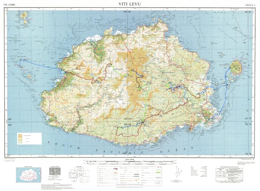
The EVG-made custom map of Fiji that contains elevation data, 50K and 250K topographic information, and bathymetric data.
A few months after East View Geospatial supplied mapping to the Eco-Challenge production team, their proposed route was given the go-ahead. With a clearly defined area of interest, the conversation turned to data inputs, and East View Geospatial’s well-honed GeoConsulting abilities took center stage.
When EVG does consulting for its clients, the goal is two-fold. We want clients to know the full extent of their options, and we want to leave them better educated than before our engagement.
Eco-Challenge needed custom maps created for competitors and production personnel. As these maps differ in purpose, the necessary data was far-ranging. Knowing what ‘ingredients’ to combine to build certain kinds of maps is knowledge gained from decades of experience; anticipating other information is another hallmark of that expertise.
When the team mentioned their desire to create a web app to track competitors’ movements in real time, for example, we leaned on our unparalleled collection and supply network to procure remotely sensed data including satellite imagery and terrain data. Without this information, 3-D visualization would not be possible. More information on this portion of the project will come in future blogs.
In the end, we provided national topographic maps at 50K and 250K scale, bathymetric data derived from nautical charts (essentially sea-floor terrain), multi-resolution satellite imagery, and elevation data.
The production team finalized the routes during this phase, and we moved on to determining the precise kinds and number of maps needed for the production team and competitors.
Eco-Challenge: Providing Authoritative Data For Location Evaluation & Planning
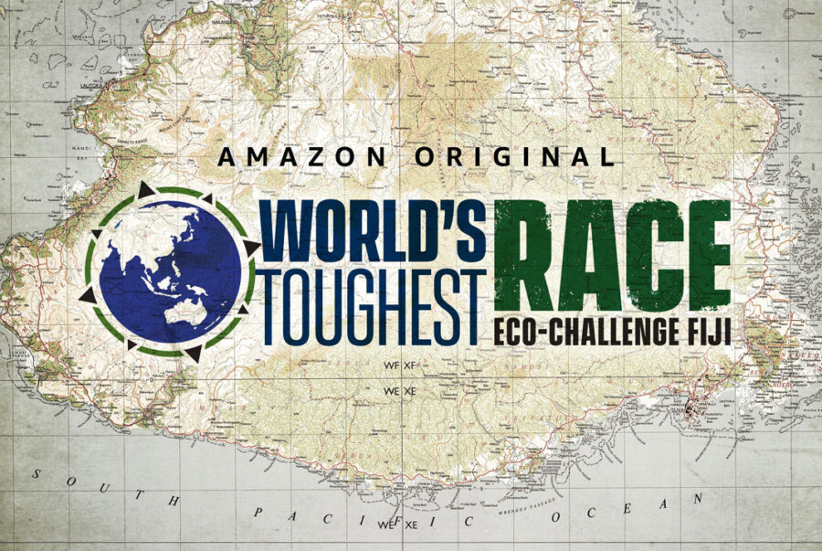
Image courtesy of Amazon.
In late 2018, the Eco-Challenge scout team moved through the lush valleys and dense jungles of Fiji, evaluating the island for their upcoming joint television production with MGM and Amazon Studios, World’s Toughest Race: Eco-Challenge Fiji.
The competition pits 66 teams from around the world against each other in a round-the-clock race over, into, and through hundreds of miles of Fijian wilderness. To navigate the jungles, beaches, and rocky faces of the island, the teams use only paper maps and a compass. To track the teams, stay organized, and create compelling television, the production crew required a far more diverse array of geospatial resources.
Before embarking on their evaluation mission, Eco-Challenge turned to East View Geospatial.
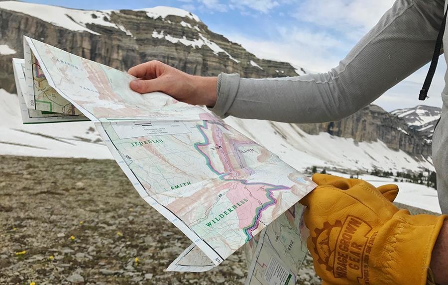
The team’s first need: detailed, authoritative maps of the territory they were scouting to define optimal routes, plan the checkpoints and emergency stations, etc. Our partnership with National Mapping Agencies in Fiji, combined with our comprehensive collection of physical and digital mapping options, enabled us to offer quality information to the team simply and efficiently – precisely why we do things the way we do.
We procured and supplied a collection of 1:50,000 and 1:250,000 national topo maps of the island. Our existing partnership with the Ministry of Lands and Mineral Resources of Fiji streamlined the process of collecting the geospatial information the team needed, and scouting commenced.
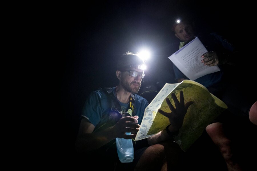
Image courtesy of Amazon.
Our collaboration deepened as the project’s needs grew and EVG’s comprehensive capabilities were put to use. Over the course of our engagement with Eco-Challenge, we would collect and distribute existing information, identify and compile comprehensive data inputs, craft custom map products for specific purposes, and even print-on-demand the physical maps needed for competitors, set-dressing, and emergency back-up purposes.
The scouts finished their work using maps we provided, and the project’s complexity increased. Now the team would need to gather more data inputs to create the mapping systems necessary to monitor and execute the production. Our next blog will outline the needs of the production team and how EVG provided the ultimate geospatial solutions.
The Role of Physical Maps in the Digital Age
Enhanced digital capabilities have revolutionized the world of maps for consumers and professionals alike. As noted in one of our previous posts, digital maps allow cartography to leave its 2-D boundaries in the past. They also allow for rapid updates and infinite customization. There are, however, several things digital maps cannot do that paper maps can – enough to make any claims about paper maps’ days being numbered ring hollow.
The biggest advantage paper maps still hold is reliability. Digital mapping tools require multiple, complex technological systems to maintain steady coordination for data to be accessible. Though relatively infrequent, threats like power outages, solar flares, or even a squirrel on a power line can interrupt these systems. A government shutdown could hamper satellite data powering GPS systems for both consumers and companies. A paper map, once created, exists until physically destroyed; all one needs is light to read it by.
This ‘feature’ comes in handy when navigating remote places of the world with tenuous (or non-existent) internet connections and sparse existing GPS data.
But what about the information on that map? Couldn’t it be outdated? The short answer is yes, but the same can be said for many digital maps as well. When accessing data digitally, like on Google Maps or Waze, there is an expectation that the map has been updated recently. Online mapping services, especially those free to consumers, are somewhat opaque about when they were last updated, though, and some applications, like OSM (Open Street Map), rely on crowd-sourced data. Intentionally or not, this data could be bad or misleading. Physical maps are transparent about when they were published and what they cover. This makes it easier to identify gaps in knowledge ahead of time.
Plus, with a little bit of pre-planning, today’s trend of print-on-demand maps makes it easier than ever to get the most accurate information into your hands, literally.
In fact, even as today’s ships and airplanes use digital data to navigate the air and seas, paper aeronautical and hydrographic charts are required by law as a backup. Entities in other industries, like sales and telecommunications, also keep sets of physical maps handy to ensure that their efforts will not grind to a halt due to interrupted digital data. Today’s print-on-demand capabilities mean these backup maps can be just as specific as their digital counterparts.
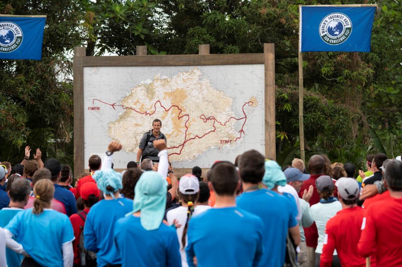
East View Geospatial has helped create and supply physical maps for sales teams and telecommunications projects in the past and can create products for incredibly specific scenarios. Our work for the new Amazon Prime series, World’s Toughest Race: Eco-Challenge Fiji, hosted by survival legend Bear Grylls, is one example. For Eco-Challenge, we created 11 different maps for the staff and contestants and printed a total of 991 copies.
What the contestants do with those maps will showcase the biggest benefit of physical maps; increased cognitive ability.
Studies have shown that the use of paper maps can stimulate more in-depth thinking and a deeper level of situational awareness than using maps on a screen. A digital map app gives A-to-B directions, and users typically follow those directions. When a wrinkle or recalculation occurs, it can be jarring. The process of digesting information from a paper map is more of a holistic brain process that hones skills like orienteering and spatial awareness.
It’s easy to infer, then, that the meandering nature of travel is often best left to the old ways, since paper maps are easier to deviate from due to their ability to impart context to users.
Of course, some maps are simply too out-of-date, too battered, or too specific to be much more than a decoration. Or, even further, ‘mapping’ paper for presents. Before that kind of recycling, though, think about whether or not your navigational skills are becoming a victim of convenience.
Maps: Historical Inaccuracies That Shaped Perception
Whether due to honest mistakes, purposeful deceptions, or the inertia of progression, inaccurate maps have consequences.
In previous posts, we have detailed how maps and geospatial data shape the very fabric of reality around us, and we’ve also chronicled the advances in accuracy through the ages. But what happens when maps, or their users, are slow to catch up with the times? Early mapping was far from accurate, and parts, we now know, were based on superstition. In other cases, they were based on deception.
“The Phantom Atlas,” by Edward Brooke-Hitching includes examples of purposeful mapping falsehoods.
In 1539, the Mexican island of Bermeja first appeared on Spanish maps. It continued to appear well into the 20th century. Starting in the 1980s, the Mexican government hoped to find it and secure oil rights on the island. Searches for the island persisted until 2009 when it was concluded the island did not exist.
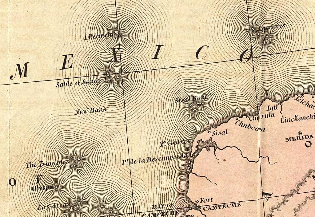
Bermeja as depicted on a Spanish map via the David Rumsey Map Collection.
Infamous deceivers like Benjamin Morrell, who ‘discovered’ islands like “New South Greenland” and “Morrell’s Land,” where only open water exists, took advantage of the public’s credulity. In 1822, Gregor MacGregor convinced 270 British colonists to sell their possessions and buy land from him in the newly-established South American country of ‘Poyais’. The problem was, MacGregor’s ‘Poyais’ land was nothing more than swampland; most of his settlers never made it back to Britain.
The trust people have in maps is significantly increased when children are the consumers. When a child sees a map of the world for the first time, it is presented as an absolute fact. In the case of older sea maps scattered with krakens and giants, children may grow up believing monsters roam the earth and seas. In the case of the standardization of the Mercator projection map, children grow up with distorted ideas about hemispheric proportions and global dynamics.
When Gerardus Mercator released his 1569 map, “A New and Enlarged Description of the Earth with Corrections for Use in Navigation,” he was not intending to introduce a standard visualization of the Earth. The map’s purpose was to allow straight lines to be drawn between ports and used as a practical tool by sailors, navigators, and travelers.
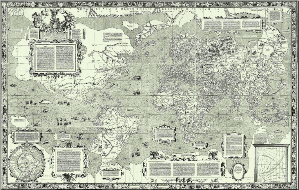
New and Enlarged Description of the Earth with Corrections for Use in Navigation Map via International Cartographic Association.
In the 19th and 20th century, as the number of mariners grew, so did the prevalence of Mercator projection maps. Anyone who has visited a Western classroom in the last half-century is familiar with this projection. The trouble is, its inaccuracies bolster attitudes of ethnocentrism, the belief in the inherent superiority of one’s own ethnic group or culture, and even unconsciously racist worldviews. The Mercator projection maps tend to emphasize European and Northern societies; in a typical version, the countries above the equator take up close to ⅔ of the page space, diminishing the importance of Southern continents and nations (whose populations are largely people of color). Jane Elliot has famously spoken about the distortion of the Mercator Projection and stated “This is not just ridiculous, it’s deliberate”. Greenland’s size in relation to South America is a good example here. In the age of colonialism, this presentation of European nations helped underscore their ideas of superiority over other nations.
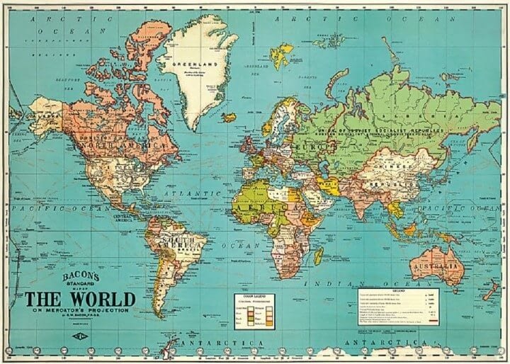
Mercator Projection, via brilliantmaps.com.
As proof that the long term use of Mercator projection maps may have less to do with accuracy and more with biased attitudes: when the Soviets undertook their ambitious world mapping endeavor, they used the Pulkovo 1942 projection.
In recent years, educators and mapping companies have worked to rectify this situation. Companies like ODT Maps are working to correct the distortion caused by longtime use of Mercator maps by distributing maps like the one developed by Arno Peters in 1974 map, which aims to be fair to all people.
As ODT Maps founder Bob Abramms says in a lecture, “for a map to show the truth, it must make a visual lie of something else”. A globe sliced apart and laid flat, for example, is not easily decipherable to a layperson. The Mercator projection shows accurate lines of passage but distorts continent proportions. Today, digital geospatial technology allows users to parse data in three dimensions, meaning fewer of these trade-offs, but it’s import to keep historical misleading cartography in mind and ensure any distortions are clearly communicated and not presented as fact.
The Evolution of Cartography
It may sound hyperbolic, but history proves that when maps change, so does humanity’s perception of itself.
Just as Cold War-era maps by the Soviet Union reflect certain ideas about that society’s worldview, so do maps left by ancient civilizations. A clay tablet from around 600 BCE called the “Babylonian Map of the World,” is thought to be among the first-ever known maps. It features Babylon in the center of the known world surrounded by water and eight triangular regions. This arrangement is thought to be a symbolic, rather than literal, representation of the world. Older maps from Greece are organized similarly.

(The Babylonian Map of the World. Known as the first map ever created. Image courtesy of Ancient History Encyclopedia.)
Around 150 BCE, Greek mathematician and geographer Ptolemy created his atlas, “Geographia.” This work is a cartographic milestone, as, while working to establish a grid that would more accurately chart birth locations for horoscopes, Ptolmey created a global coordinate system that laid groundwork for our modern system of longitude and latitude.
Ptolmey’s work had massive influence on medieval Islamic scholars. In 1154, one of those scholars, Muhammad al-Idrisi, created the most accurate map for its time. The Tabula Rogeriana. Al-Idrisi’s achievement combined Ptolmey’s system with knowledge of the Far East, Africa, and the Indian Ocean gathered by explorers and merchants.
Information from explorers and merchants continued to play a crucial part in map-making, as the 15th century saw an explosion of exploration. One of the most significant innovations from this period is Gerard Mercator’s 1569 World Map, which used a cylindrical map projection to effectively ‘flatten’ the globe for nautical travel.

(Gerard Mercator’s 1569 World Map. Image courtesy of ClassicSailor.)
Tools like telescopes, compasses, and sextants allowed for increased accuracy. These tools of surveying were put to good use on land, too. In 1912, Alfred Wegener used surveying tools to add proof to the theory of continental drift, which was eventually accepted half a century later.
The invention of the printing press pushed maps into the hands of more people than ever before. Following the Industrial Revolution, as middle classes rose and more people found more free time in their days, a spike in travelling as a hobby occurred. Map makers found demand shifting from ornate, often symbolic maps, to ones of a more utilitarian nature for use by common travelers.
World War I introduced aerial photography, which progressed through the following century into today’s world of satellite imagery, remote sensing, and LiDAR.
One of the biggest revolutions in the field was the ability to pick and choose what data to include on a given image. The first Geographic Information System (GIS) was created in Canada in 1962 by Roger Tomlinson and the Canada Land Inventory (CLI). This allowed for separation of information and attribute data, meaning more specialized visualizations. In 1973, first editions of large digitized maps made their entrance into the cartographic landscape.

(Image courtesy of ArcGIS.)
Throughout the centuries of progress, one thing remains true: maps are an abstraction of reality with some elements depicted more prominently than others. Today, as it was in the past, the cartographer’s job is to make sure it is done the most effective way possible.
Relief shading, which adds depth and dimension to maps, is just as important today as it was in the 17th century. Today, cartographers might use ESRI Toolsets instead of an ink pen, but the idea is the same. Modern cartographers make choices that help viewers of their maps understand climate change, shipping routes, special-interest hiking trails, and even make maps more accessible to individuals with color-blindness.
At East View Geospatial, our cartographic team is as busy as it has ever been, utilizing the latest and greatest mapping tools. Most recently, the team identified a gap in country map coverage for the country of Tanzania at 50K scale. Utilizing data from the Tanzania government and Maxar, as well as toolsets from ESRI, the cartographic team created 16 new map sheets, completing Tanzania’s map coverage for the first time in history. This entire project was executed remotely, without any EVG personnel having boots on the ground in Tanzania. The entire project would not have been possible without innovation in the cartographic space over the past centuries. To see how this project was executed, EVG created a brief StoryMap that breaks down the process. As a company, we are constantly pushing the boundaries to find new ways of sourcing data and executing the cartographic production process to bring the most authoritative maps to market.