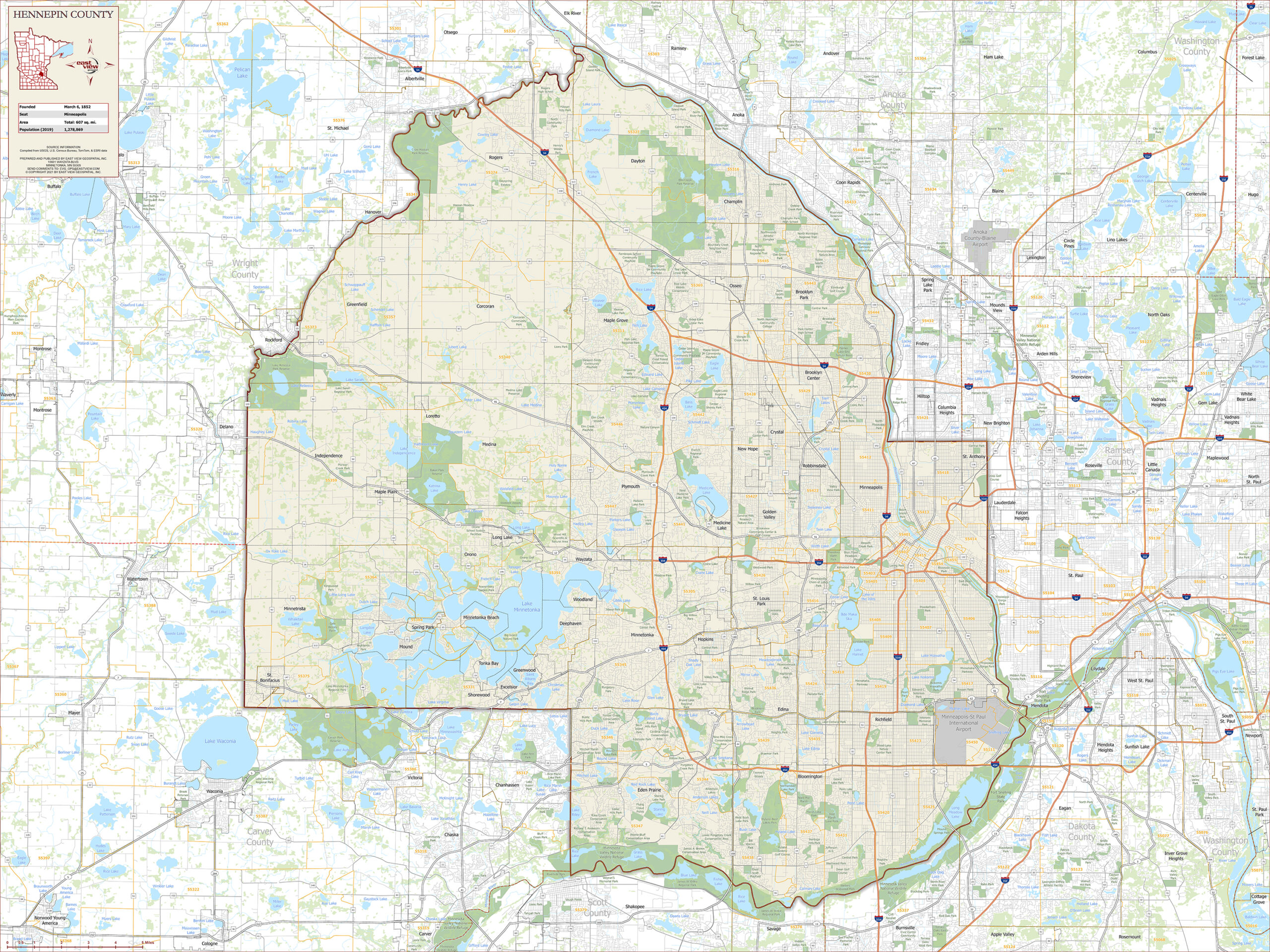
The Rich History of Soviet Mapping
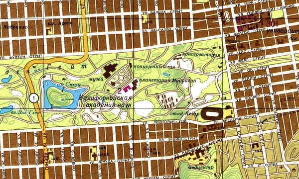
A Soviet map of Golden Gate Park in San Francisco, California.
Following World War II, the Soviet Union set out to map the entire world. The full story of how they did this remains untold, but the legacy of the maps they produced is clear; they are potentially the pinnacle of pre-satellite-era cartography, rich in both aesthetics and diverse data.
Scholars and researchers have used the maps to gain perspective of the USSR worldview. Some argue that the combination of topography with human infrastructure represents an attempt to synthesize the two and express a post-revolutionary worldview. From a more practical standpoint, the map’s content points to potential objectives; from invading (or defending) to understanding.
The maps feature topographic and geographic features, but the amount of auxiliary information they contain is astonishing. Widths of streets, sizes of buildings, and even construction materials and conditions of roadways are recorded in cities around the world. In mountainous regions like Afghanistan, maps include notes on times of year when snow clears from mountain passes. In other areas, maps note where to find edible vegetation and drinkable water. Some even feature the inclusion of military and research facilities that do not appear on official maps from the surveyed country.
In 2005, East View, which has assembled the world’s largest single collection of these maps, translated and published a Russian military manual that provides instructions for how the maps are to be used in planning and executing operations. Tables in the manual provide even more detailed information, like how far certain sounds travel in a given area, even accounting for what kind of material the sound was made on: everything from an idling tank to footsteps to a snapped tree branch.

A Soviet map of the Pentagon in Washington, D.C.
Some of the Soviets’ quest for granular detail in their maps must have come from their military strengths. While the United States Air Force maintained air superiority, Russian forces relied on tank and ground forces. While the Americans were able to formulate a strategy from the sky, the Soviets needed maps that allowed them to plan for more precise ground operations. Typically, 1:50,000 is an ideal scale for such activity.
The Soviet military’s mapping of worldwide urban centers was unparalleled until the arrival of Google Maps. Thousands of cities are mapped at scale 1:10,000 and 1:25,000 – and comprehensively so, not just potential military targets. The detailed mapping of cities like Washington, DC, New York, San Francisco and Seattle are perhaps expected by an adversary. But Pueblo, CO, Madison, WI and Shreveport, LA – points to an obsession within cataloging and measuring American postwar industry and business strength.
The maps were made using a combination of existing official sources (similarities to maps produced by the Ordnance Survey and by US Geological Survey are too numerous to be coincidental), on-the-ground surveyors, reconnaissance aerial photography, and, presumably, spies. Teams were sent out to some of the furthest corners of the earth in pursuit of cartographic knowledge, and some died in their pursuit. Russian cartographer Alexy Postnikov, who, when on assignment to survey a remote area of Yakutiya in the 1960s, found an inscription left by an ill-fated cartographer from 1948. It was left 200 km away from the nearest populated area and stated that he and an injured aide were alone without supplies and fending off bear attacks.

A 1980 Soviet map of San Diego naval facilities (left) compared with a US Geological Survey map of the same area, from 1978 (revised from 1967).
Regardless of the maps’ purpose, it is clear the Soviet government regarded them as precious. Access to them was highly restricted. A strict system of checking out the maps existed, and ex-military members describe feeling that, even if it had been partially or totally destroyed, whatever pieces remained needed to be returned.
When the Soviet Union fell and laws changed, officials and others with access to them started marketing the maps bit by bit to a scattered constellation of buyers, which is how the world knows about them today.
“What remains most impressive about the Soviet maps was their uptake and utilization by industries far and wide – both commercial and consumer”, notes Jonathan Thompson, Director of Sales & Marketing for East View Geospatial. “From telecom and utility to aviation and insurance companies, as well as recreationists and historians alike, these maps have been and continue to be highly regarded and used for countless applications. In fact, for some regions of the world, they still represent the highest quality published topographic information.”
More information about the maps is available in The Red Atlas, a book by John Davies and Alexander J. Kent, which gives an in-depth history of their creation and use. We also recommend reading “Inside The Secret World of Russia’s Cold War Mapmakers” by Wired. East View had the opportunity to contribute their knowledge of Soviet mapping in both The Red Atlas and the Wired article.
For those wanting to dive into the depths of these maps, East View Geospatial’s MapVault service provides access to our vast collection of Soviet mapping as a web mapping service. Each map is available individually in a variety of print and digital formats at shop.geospatial.com.
As cartography continues its march into the future with computer and satellite-aided tools, the painstaking efforts of those Soviet topographers, surveyors, and others will continue to provide an example of outstanding tradecraft whose relevance and value continue to find new applications.
Geospatial Terms Made Easy: What Is Raster and Vector Data?
Data drives all cartography- without it, maps couldn’t be made. There are countless types of data- each delivering their own unique value and insights. However, all types of mapping data fall into one of two categories: Vector Data or Raster Data. We spoke with Geospatial Analyst, Kelli Hercules, about why raster and vector data are important, how they differ, and their respective benefits when it comes to displaying specific data.
“Vector data is made up of points, lines, and polygons; all of which are used to represent real-world features in maps. All geometry types store information in x/y coordinates.
For EVG’s use of vector data:
- Point data usually represents small features, such as small buildings, pylons, landmark significant features.
- Line data represents features, such as: transportation (roads, cart tracks, trails), rivers, cables, pipelines.
- Polygon data represents features, such as: land cover, area hydrography, large buildings, city/county/state/country boundaries.

(Image courtesy of firenorth.org.au)
Raster data is made of pixels that are compiled into rows and columns. Primarily you will see raster data used in digital aerial photographs, satellite imagery, or even digital pictures. However, raster data can be organized into two separate categories, discrete data & continuous data.
- Discrete rasters are easy to distinguish as the data is organized into themes. Where one value might represent land cover, another may represent a river.
- Continuous rasters represent values that are above/below sea level. Digital elevation models are a good example of continuous raster data.”
How does this apply to your work at EVG?
“Both raster and vector data are important for our day to day tasks here at East View Geospatial. When we source data in-house, the data would be procured as a vector (points, lines, and polygons). This data is amassed in four different areas/themes: Hydrography, Transportation, Culture, and Land Cover. These two data types can also be utilized simultaneously. Raster data is necessary for feature data collection, in which the data being collected is vector data. Whether we procure our data or use data from other sources, vector and raster data are at the core of what we do here at East View Geospatial.”
Raster data and vector data are the base of all things geospatial. At the most granular level, all datasets will either be a raster dataset or vector dataset. With the cartographic process becoming almost 100% digital, it is crucial for cartographers to fully understand the differences and nuances of both types of data.

Kelli Hercules, Geospatial Analyst
The Geospatial Convergence: How Geospatial Information Helps The Media Industry Illustrate What Can’t Naturally Be Seen

(Image courtesy of Esri)
If the end goal of media is to transmit big ideas and meaningful stories to readers and viewers, then geospatial data is indispensable. Whether the media is fact-based or complete fantasy, geospatial information and technology provide insights, context, and color to the data presented in a story.
In much the same way that data-rich GIS visualizations are valuable in courtrooms, their ability to relay complex info to laypeople is impactful in the media realm.
From weather patterns to following a population over time, tracking supply chains to following a viral outbreak, the news media makes use of GIS data to help break down big ideas for their viewers. Maps can give context that might lack in an old-fashioned spreadsheet infographic.
For example, election results on a spreadsheet-like table or chart might convey the winners and losers of a contest, but added context of past and present economic, social, and other data in the same voting district is where media consumers can begin to make sense of new information.
The integration has become so commonplace that the New York Times even holds “data bootcamps” to ensure its writing and editing staff have a proper handle on the technology.
A frequently-cited example of geospatial data’s importance in journalism is then-Miami Herald journalist Steve Doig’s work on the damage left behind by 1992’s Hurricane Andrew.

(Image courtesy of Risk Management Services)
He placed layers of data over one another: wind speed and damage assessment. This spacial analysis led him to determine that developers had been allowed to put up haphazard construction, leaving properties vulnerable to hurricanes. This insight not only put blame on the relaxed regulations in place, but it also allowed for future preparation for storms in the area.
Other corners of the media industry use GIS data to simulate multi-layered destruction, in an effort to bring fictional stories as close to real-life as possible. Geospatial information helps embellish imagined worlds on TV and movie screens in a similar fashion to how it does in video games.
For the havoc created by extraterrestrial visitors to Earth in 2016’s Independence Day: Resurgence, Esri’s CityEngine was used to create lifelike renderings of real cities like Singapore to be annihilated. Nine months of work went into roughly forty seconds of footage, but that work can now be built upon (even if it was wiped out in a simulation run for the movie).

(Image courtesy of geoinformatics.com)
For the future-ruins of Las Vegas in BladeRunner 2049, the movie’s visual effects team, Framestore, turned to CityEngine. They based the foundations of their version of Las Vegas on government maps, then continued to embellish it with other data. The effect is a startlingly real-seeming expanse of waste and degraded architecture that feels close enough to the real city to be jarring. That might explain why Framestore was awarded an Academy Award for their work on BladeRunner 2049.
In short, geospatial data continues to play an important role within television, journalism and movies to illustrate data, draw insights and create real-life landscapes. Given the constant innovation within this field, it will be fascinating to observe how GIS and cartography will be integrated within the Media industry as technology evolves.
Key Takeaways:
- GIS data helps the media industry pass on stories and information to consumers in more easy-to-digest formats than charts, spreadsheets, and paragraphs.
- In journalism, the ability to layer data points out previously hidden societal dynamics, and the ability to render findings into map form helps readers and viewers digest the information quicker.
- Movies have begun using technology like Ersi’s CityEngine to create lifelike renderings of cities (both real and imagined) with reality-based detailing, thus heightening audience immersion.
The Geospatial Convergence: The Case-Closing Impacts of Geospatial Data on Litigation
(Image courtesy of Point of Beginning)
In litigation, a clear explanation of a complex situation can win the case. Though printed spreadsheets, maps, and reports are effective, assembling their disparate facts into a convincing narrative can take up valuable time and resources. Today’s digital GIS capabilities accelerate both analysis and data acquisition, while also improving accuracy.
Recreation & Simulation
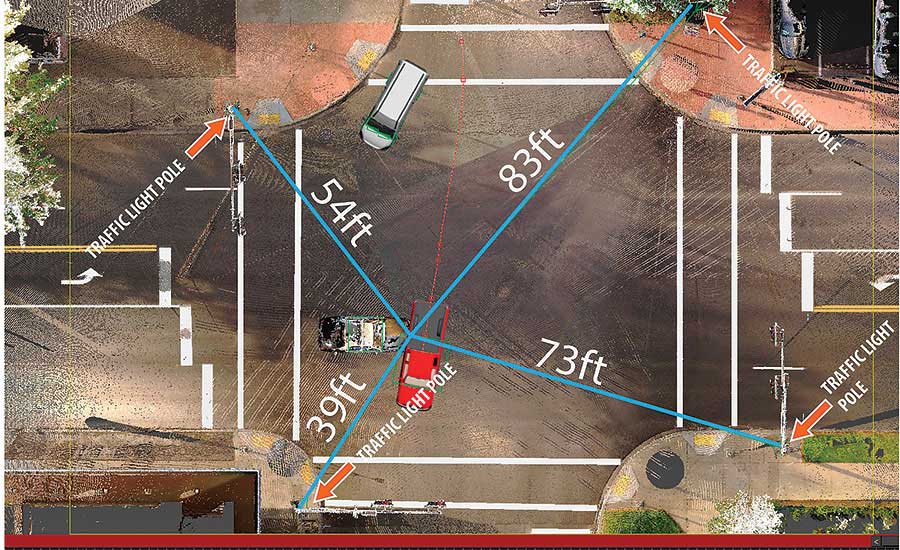
Recreation and simulation are two of the most convincing ways geospatial data can be used in a courtroom. This is true across the spectrum of litigious issues: from vehicle accidents and personal injuries to medical malpractice and product liability, a litigator’s ability to be clear and accurate is essential.
Site data, orthographic images (aerial images made to reflect actual scale), and topography can be combined to render a realistic depiction of events described by witnesses. By giving decision-makers a visual model of events, litigators help them make more accurate decisions. The interactive nature of these models allows for the court to see an incident from other perspectives, too.
Virtual simulations of events are fashioned out of much of the same information; site data is gathered, then run through a computer-assisted simulation. This is less common, and subject to more stringent vetting to be used as evidence, but is helpful nonetheless. It can be especially useful in lawsuits that involve uncommon activities like repelling or snowboarding, as a tool to reconstruct and animate a sequence of events that may otherwise confuse judges and juries.
Boundary Disputes
In boundary disputes, the value of geospatial data is hard to overstate. Drone mapping has increased accuracy in litigation around these kinds of issues, and not just for big companies or governments.
Organizations like Earthjustice utilize GIS data to aid those in need of advocacy. In 2018, the Pawnee Nation and Earthjustice proved that seventeen oil and gas leases had been illegally approved by the US Government on Pawnee lands. To date, the US Government walked back approval of all but four of those leases.

(Oil tracking image courtesy of Earthjustice)
In Montana, Earthjustice was able to help residents prove that the Bureau of Land Management’s issuance of 287 oil and gas leases did not consider risks to the state’s water and environment. A federal judge reversed the approval. Without access to compelling data, this might not have been possible.
Earthjustice also uses GIS to give the public ways to visualize issues. Their ‘Fraccidents’ map displays all the accidents related to the practice across the country, and, to illustrate the scale of a proposed fracking project, transposed it onto New York City.

(‘Fraccidents’ map courtesy of Earthjustice)
Some of the data and tools used by organizations come from private initiatives, like Esri’s Conservation Program, which connected environmental activists to geospatial resources from 1989 to 2019. The program provided software, training, databases, and connection to experts.
Today, the initiative’s work continues at https://community.esri.com/groups/conservation-gis. There, the work and findings of previous grantees have been compiled in the Conservation GIS Reference Project.
Key Takeaways:
- In litigation, geospatial information is primarily used for either event recreation or data collection.
- The ability to reconstruct or simulate events adds depth and clarity to witness testimony and allows for other perspectives of an incident to be viewed.
- The increasingly widespread availability of GIS data has shortened the technological-capability gap between big entities like governments or companies and smaller ones like Earthjustice or the Pawnee Nation.
Geospatial Terms Made Easy: What is a GeoMosaic?
Maps come in all shapes, sizes, and scales. Often, it can be difficult to find a map that displays the entire geographic area you want to see at the correct scale- either the scale is too small, or there are multiple sheets at a larger scale that do not cohesively blend. This is where geomosaics come in handy. This process allows map sheets to be joined seamlessly, allowing the viewer to see an area larger than what could be displayed on single paper maps. We asked our Director of Operations, Daron Anderson, about why geomosaics are so important in the comprehension and interpretation of maps and geospatial data.
“A geomosaic is a merge of two or more raster images. Geomosaics are ideal for distributing large amounts of raster data in a compressed and efficient way. Topographic maps, thematic maps, digital elevation models or imagery could all be types of raster images used to create a geomosaic. Geomosaics provide seamless map coverage over a certain location or region, making it easier to pinpoint and personalize the geographic area you want to see. There are many formats of geomosaics, which include: GeoTIFF, ECW, JPEG2000, GeoPackage and MBTiles.

PICTURED: A GeoMosaic of Myanmar. You can see the different boundaries for the sheets, but they are seamlessly integrated together on our MapVault service.
How does this apply to your work at EVG?
EVG has thousands of authoritative raster map series, in many formats all over the world. By creating geomosaics, we can make discovery and ease of use very simple. Use cases for geomosaics include basemaps, discovery, research and presentation. EVG geomosaics can be served to our clients via web services, including our own streaming service MapVault. In short, geomosaics allow people to view several map sheets simultaneously and seamlessly, making it easier to view and analyze specific geographic areas.”
Geomosaics represent a fusion of old and new technology- it allows historic maps in analog format to be digitized, georeferenced, and fused with other maps to display large-area seamless coverage. Our MapVault web mapping tile services allow clients to see all the different map sheets and series that we offer and choose which specific sheets they’d like to see. Geomosaics make maps faster and easier to view and understand, as they can be tailored to show specific geographic areas that could not be observed in the traditional sheet format.

Daron Anderson, Director of Operations