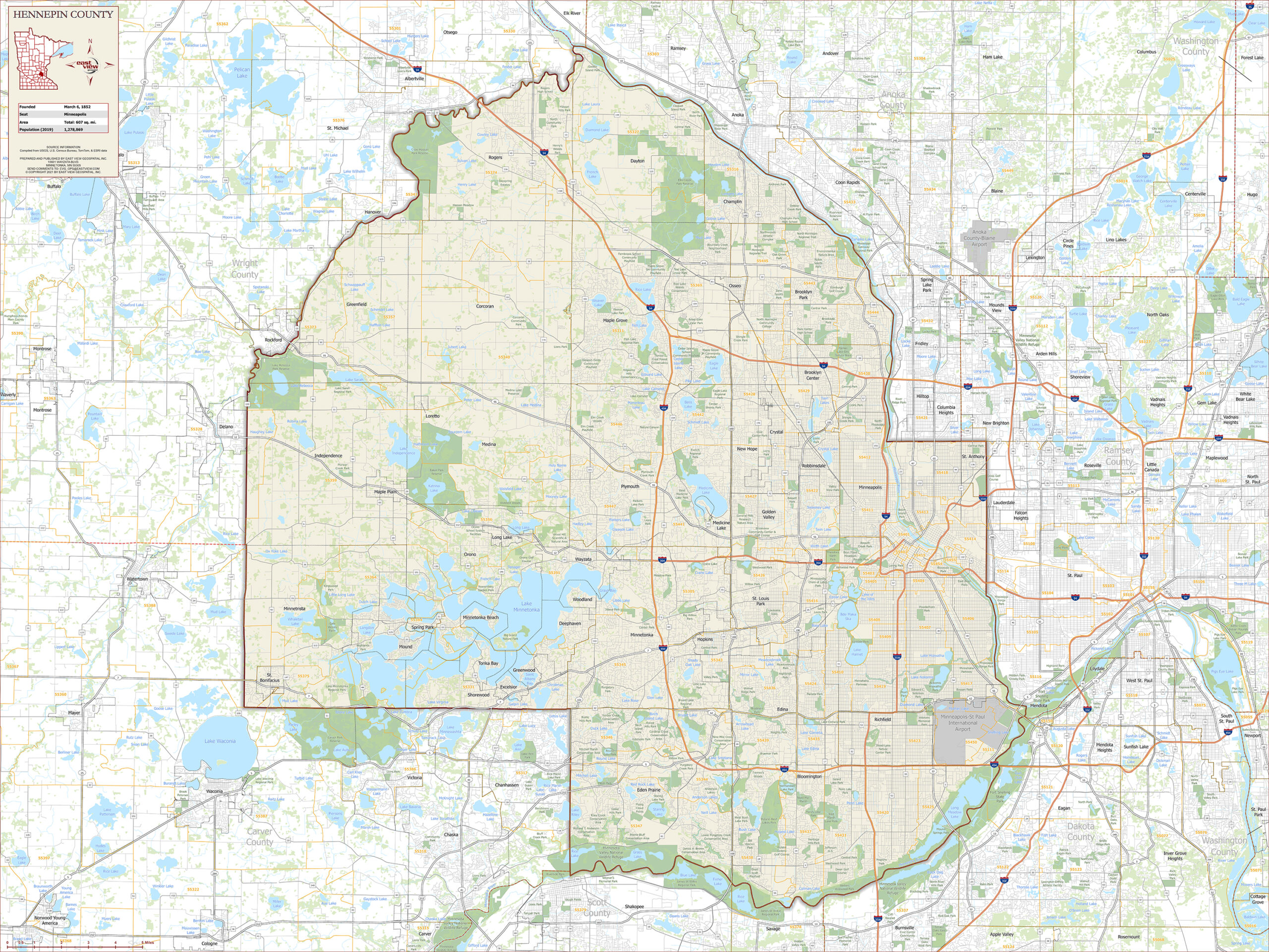
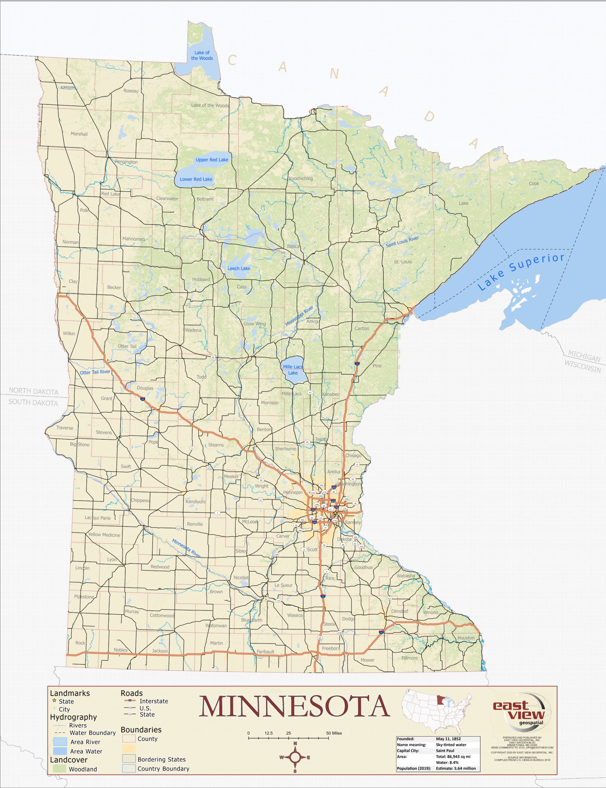
It may sound hyperbolic, but history proves that when maps change, so does humanity’s perception of itself.
Just as Cold War-era maps by the Soviet Union reflect certain ideas about that society’s worldview, so do maps left by ancient civilizations. A clay tablet from around 600 BCE called the “Babylonian Map of the World,” is thought to be among the first-ever known maps. It features Babylon in the center of the known world surrounded by water and eight triangular regions. This arrangement is thought to be a symbolic, rather than literal, representation of the world. Older maps from Greece are organized similarly.

(The Babylonian Map of the World. Known as the first map ever created. Image courtesy of Ancient History Encyclopedia.)
Around 150 BCE, Greek mathematician and geographer Ptolemy created his atlas, “Geographia.” This work is a cartographic milestone, as, while working to establish a grid that would more accurately chart birth locations for horoscopes, Ptolmey created a global coordinate system that laid groundwork for our modern system of longitude and latitude.
Ptolmey’s work had massive influence on medieval Islamic scholars. In 1154, one of those scholars, Muhammad al-Idrisi, created the most accurate map for its time. The Tabula Rogeriana. Al-Idrisi’s achievement combined Ptolmey’s system with knowledge of the Far East, Africa, and the Indian Ocean gathered by explorers and merchants.
Information from explorers and merchants continued to play a crucial part in map-making, as the 15th century saw an explosion of exploration. One of the most significant innovations from this period is Gerard Mercator’s 1569 World Map, which used a cylindrical map projection to effectively ‘flatten’ the globe for nautical travel.

(Gerard Mercator’s 1569 World Map. Image courtesy of ClassicSailor.)
Tools like telescopes, compasses, and sextants allowed for increased accuracy. These tools of surveying were put to good use on land, too. In 1912, Alfred Wegener used surveying tools to add proof to the theory of continental drift, which was eventually accepted half a century later.
The invention of the printing press pushed maps into the hands of more people than ever before. Following the Industrial Revolution, as middle classes rose and more people found more free time in their days, a spike in travelling as a hobby occurred. Map makers found demand shifting from ornate, often symbolic maps, to ones of a more utilitarian nature for use by common travelers.
World War I introduced aerial photography, which progressed through the following century into today’s world of satellite imagery, remote sensing, and LiDAR.
One of the biggest revolutions in the field was the ability to pick and choose what data to include on a given image. The first Geographic Information System (GIS) was created in Canada in 1962 by Roger Tomlinson and the Canada Land Inventory (CLI). This allowed for separation of information and attribute data, meaning more specialized visualizations. In 1973, first editions of large digitized maps made their entrance into the cartographic landscape.

(Image courtesy of ArcGIS.)
Throughout the centuries of progress, one thing remains true: maps are an abstraction of reality with some elements depicted more prominently than others. Today, as it was in the past, the cartographer’s job is to make sure it is done the most effective way possible.
Relief shading, which adds depth and dimension to maps, is just as important today as it was in the 17th century. Today, cartographers might use ESRI Toolsets instead of an ink pen, but the idea is the same. Modern cartographers make choices that help viewers of their maps understand climate change, shipping routes, special-interest hiking trails, and even make maps more accessible to individuals with color-blindness.
At East View Geospatial, our cartographic team is as busy as it has ever been, utilizing the latest and greatest mapping tools. Most recently, the team identified a gap in country map coverage for the country of Tanzania at 50K scale. Utilizing data from the Tanzania government and Maxar, as well as toolsets from ESRI, the cartographic team created 16 new map sheets, completing Tanzania’s map coverage for the first time in history. This entire project was executed remotely, without any EVG personnel having boots on the ground in Tanzania. The entire project would not have been possible without innovation in the cartographic space over the past centuries. To see how this project was executed, EVG created a brief StoryMap that breaks down the process. As a company, we are constantly pushing the boundaries to find new ways of sourcing data and executing the cartographic production process to bring the most authoritative maps to market.


