We have previously written about the way maps can shape people’s conception of reality. That dynamic holds true in the realm of politics, too – especially during a national election.
In the United States last week, as election results for the national presidential contest started coming in, broadcast television became a torrent of maps. On this night, the map is the star of the show – as the protagonist or antagonist depends on your political persuasion. More importantly, these maps, used by anchors and correspondents to aid the electorate in visualizing the results, are all data-driven and powered by GIS technology. The most ubiquitous variety is a flat choropleth map. This is the now-familiar thematic map of the states color-coded according to which party their popular votes go for.
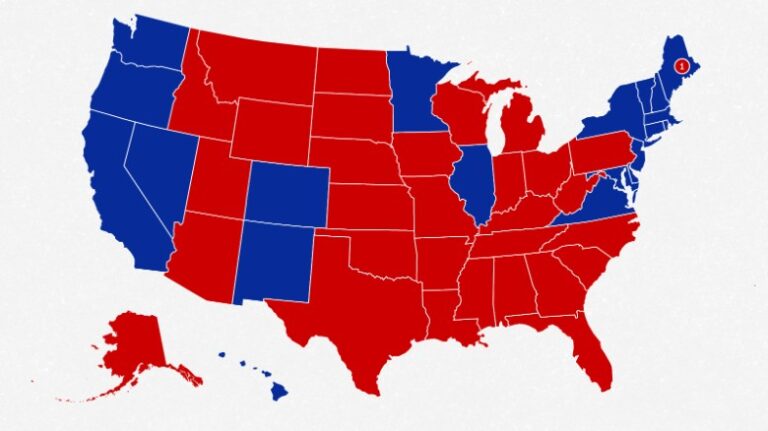
A choropleth map of electoral college results from the 2016 U.S. Presidential election. Map courtesy of CNN.
The electoral college system dictates that Americans’ votes are tallied state by state. Winners receive points, known as electoral votes, for the states they win. These flat maps, with (usually) large swaths of red dominating states with larger territory than populations are how most Americans mentally organize the political landscape of their county. The real picture, however, is far more nuanced.
While flat, color-coded choropleth maps depict the differences in state-to-state political outcomes, they cannot accurately represent outcomes in terms of actual percentage of population. In these cases, maps that emphasize population, rather than district boundaries, can be better visualizations of the national situation.
One option is a cartogram, a map where a variable like population or income is used instead of land area. In the case of US elections, a cartogram representation would distort the familiar shape of the continental United States into shapes that reflect numbers of voters instead. The swirling lines of Ersi cartographer Kenneth Field’s 2016 contiguous cartogram shows that effect.
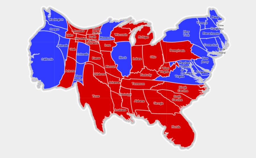
A contiguous cartogram of the 2016 U.S. Presidential election results created by Esri.
In 2016, Field created a variety of thematic maps of the 2016 presidential election. These range from traditional to borderline-fantastical (one map allows for a layer of Star Wars Tie Fighters to appear). In some, the difference comes down to symbology such as color or texture. His choropleth unclassed blended hue map takes a flat map and breaks it into voting districts. The result is a more visually diverse representation than when single colors are applied state-by-state.
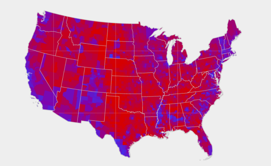
A blended choropleth map of the results of the 2016 U.S. Presidential election. Map courtesy of Esri.
These advances in mapping are not the first time the American population has seen an enhanced ability to break down its election results. After the 1880 presidential election, Harry Gannett, census superintendent, drew a map that broke down results in a district-by-district way. This shifted the thinking about the political solidarity of states.
Will election maps on TV look any different come 2022? Potentially, though the flat choropleth map does have one advantage: it’s can be easily interpreted even when the TV is muted.