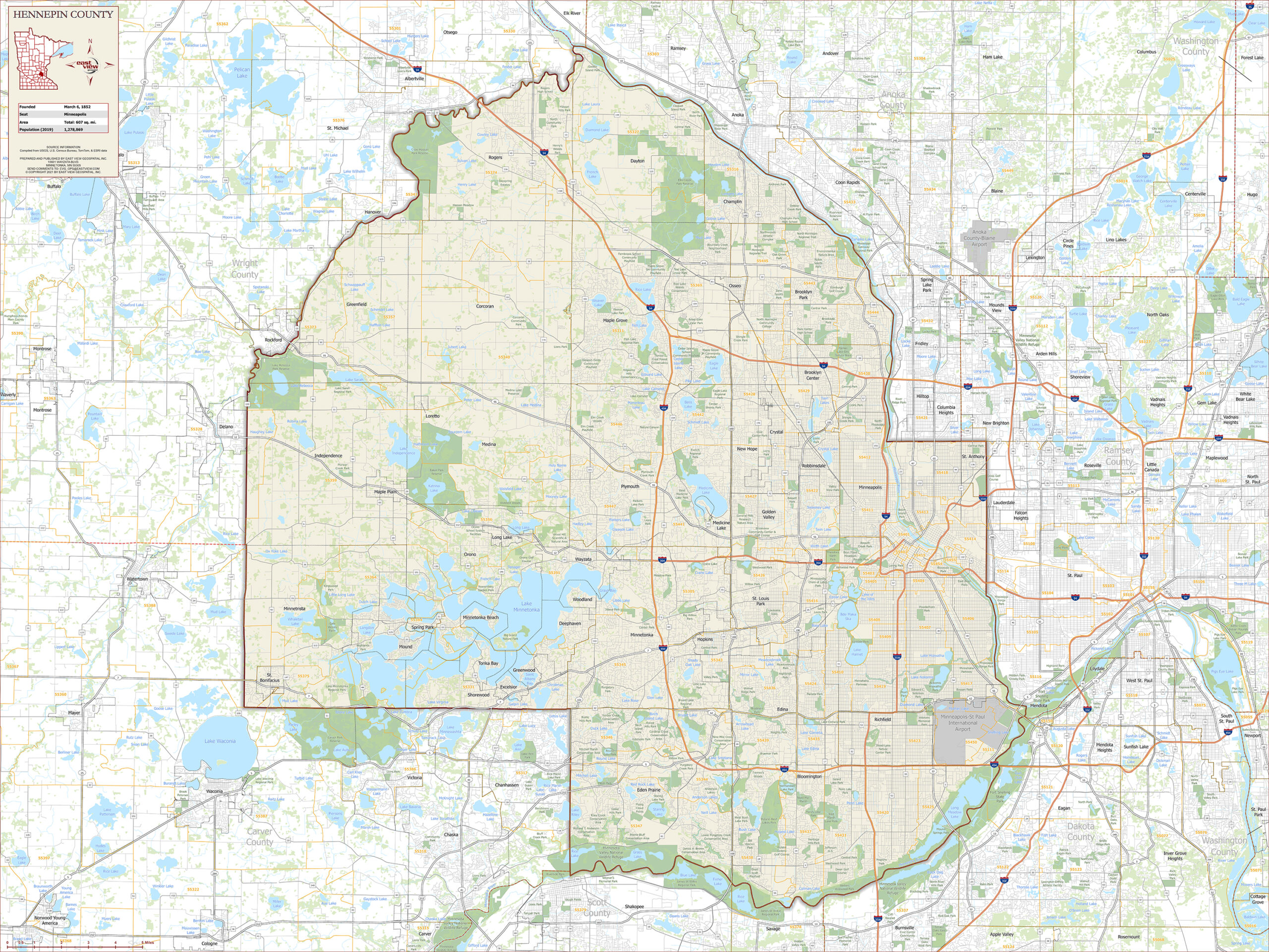
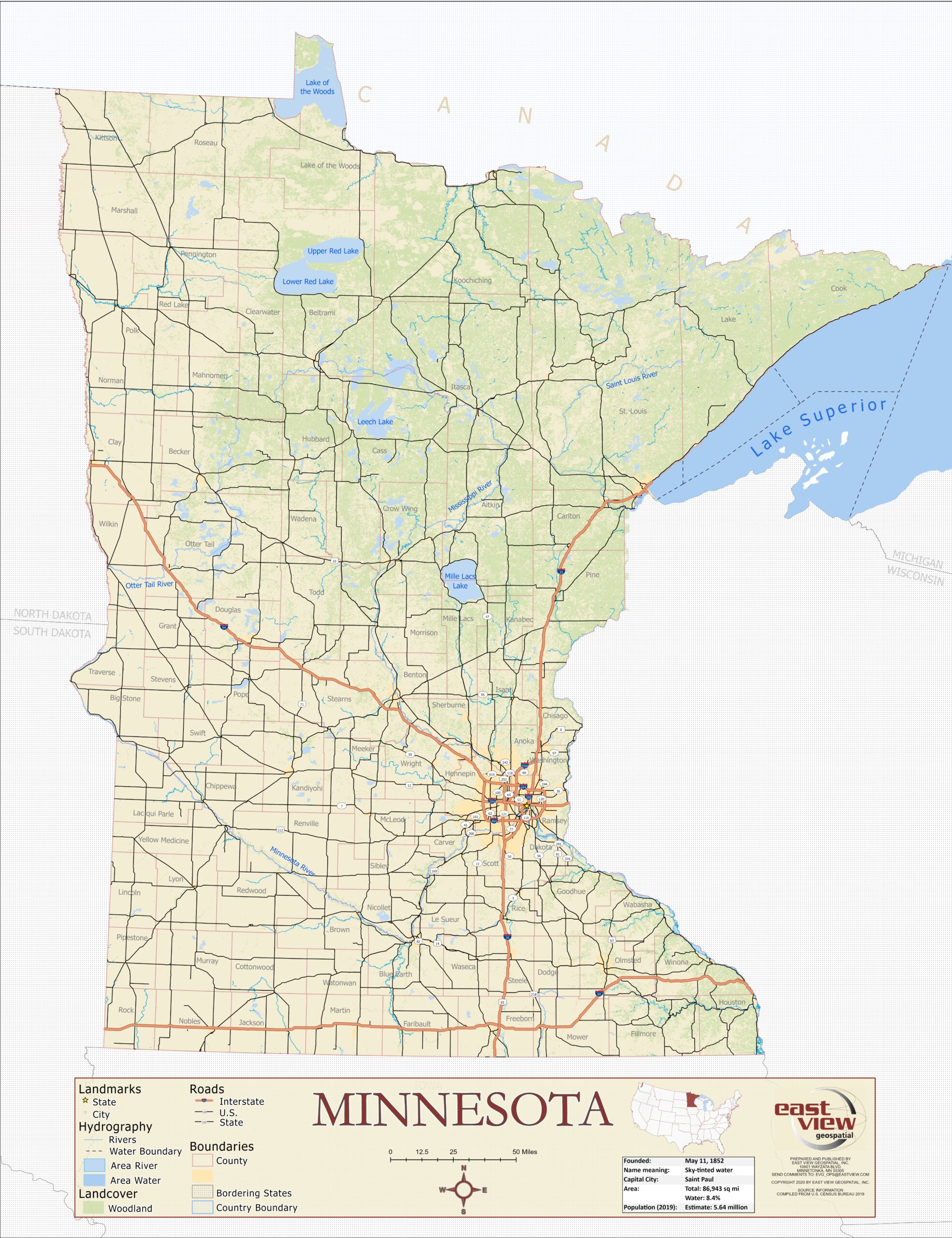
As anyone who’s ever scoured raw county reports from a secretary of state page knows, election results are not easily digestible by nature. Raw numbers may have stories to tell, but humans process visual data, whether color-coded, textured, uniquely-shaped, or otherwise, much faster. That’s why major news outlets and academic institutions utilize spatial data and GIS to broadcast and analyze election results, both in real-time and years after.
In fact, some even use it in the lead-up, to predict results. FiveThirtyEight’s popular election prediction map for the 2020 presidential election allows users to move votes in and out of states, to see the possible electoral outcomes. The underpinnings of this are rooted in GIS and spatial data. The map must consider various elements, like if the state is a winner take all or proportional awarder of electoral votes, as well as precinct and district boundaries. This isn’t the only method people use to predict elections; Twitter tracks reactions and engagement to various news stories, and Amazon’s data regarding political book sales, when geocoded, can reveal trends polls might miss.
Once the votes are in, however, all eyes are on the actual results of the contest. This UCLA Sandbox article explains one process for creating a map that reflects the results of an election contest.
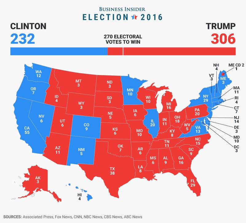
Election results, or, ‘tabular data,’ are essentially raw vote tallies in spreadsheet form. These are combined with state, county, or district geographic data. Once the two are paired and linked, numbers are assigned to locations on a map, and a digestible picture emerges. From there, color-coding can be applied, like in the US, where ‘red’ symbolizes Republican votes and ‘blue’ represents Democratic ones.
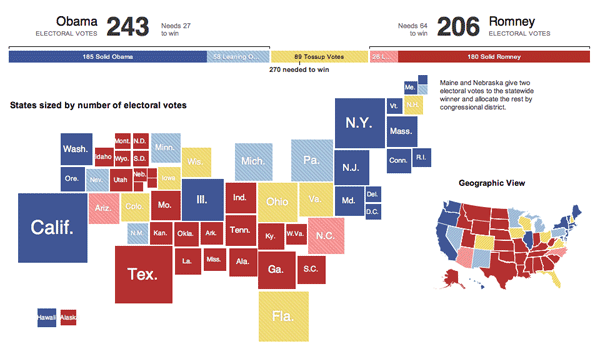
How the data is visualized is up to the content provider. This GIS Lounge article takes a look at the various forms of visualization utilized by major news providers after the US presidential election in 2012. An example of unique visualization comes from The New York Times, this map (seen below) displays state size to reflect the number of electoral votes each state has, the more electoral votes, the larger the box representing the state. The resulting map uses color (red for Republican, blue for Democrat, and yellow for Tossup) to display which way states voted in the 2012 presidential election.
Election analysis doesn’t end when winners are declared, though. Political scientists and journalists use past elections to glean insights about the country’s political attitudes. This study, for example, analyzes the increasing polarization of voters. Thanks to publicly shared shapefiles, precinct data, demographic data, and digital boundary definitions, this kind of analysis is not solely for the big-money major news networks anymore. GIS & other spatial technology have made it easier for all to understand election data and results through visualization.
See our other two blog posts on how geospatial information plays an important role in political campaigns & elections:
Increasing Fairness & Accessibility in Elections Through Spatial Data
How U.S. Election Campaigns Harness GIS Data For Voter Outreach