SAR: Seeing Beyond the Visible
The ability to ‘see’ through darkness and weather events from space makes SAR data an invaluable asset in wide ranging endeavors from tracking changes in topography to sharpening responses to cyclonic storms, floods, earthquakes, oil spills, and other disasters.
Most recently, satellites operated by NASA’s Jet Propulsion Laboratories are providing SAR data for NASA’s effort to ‘see’ the COVID-19 pandemic from space. The initiative tracks changes in human activity as lockdowns are enacted and lifted across the globe.
This is a prime example of SAR data’s ability to enhance change detection capabilities. Because human activity occurs more or less regardless of light or weather conditions, optical data alone falls short in this project. SAR data’s unblinking look at patterns of human movement over a period of time, however, offers clear benefits.
SAR data is also capable of tracking change over much shorter periods of time than the recent lockdowns. In 2015, days after an 8.3 magnitude earthquake shook Chile, Alaska Satellite Facility scientists used SAR data from the Sentinel-1A satellite to create an image depicting an 8.5 cm line-of-sight motion.
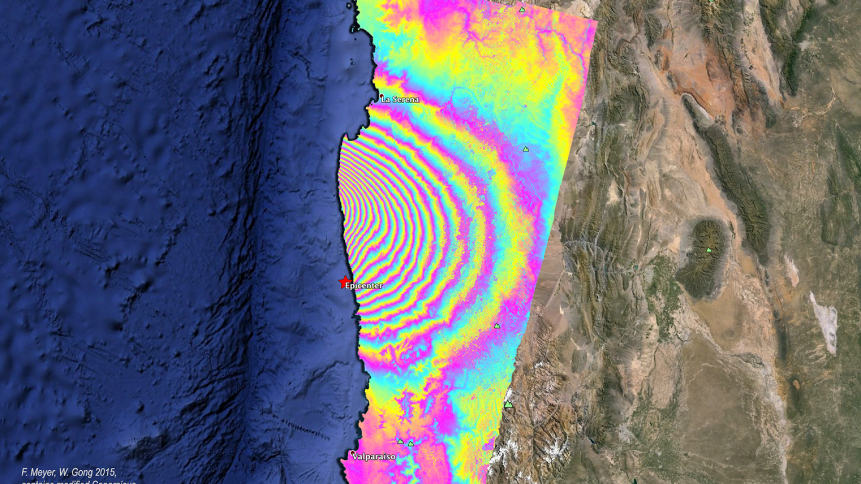
Image courtesy of The Alaska Satellite Facility, F. Meyer, & W. Gong (2015)
In 2010, SAR technology was instrumental in NASA’s efforts to support responses to the Deepwater-Horizon oil rig blowout. The data was used to (among other things) characterize oil in open water and track its progress toward coast and marshlands. In this instance, too, the ability to function irrespective of sunlight or weather is a clear and sound benefit.
That ability does come with some challenges. Namely, raw SAR data contains noisy images that require training and software to overcome. As more SAR data makes its way into the hands of users and experts, however, processes are being developed to make SAR data increasingly useable for those who have questions it might answer.
Studies, like this one by the Remote Sensing Division of Instituto Nacional de Pesquisas Espaciais, Brazil, work to alleviate issues of stabilization when imaging forests. That work enables faster progress on early warning systems for deforestation, which are key components for governmental forest reduction policies.
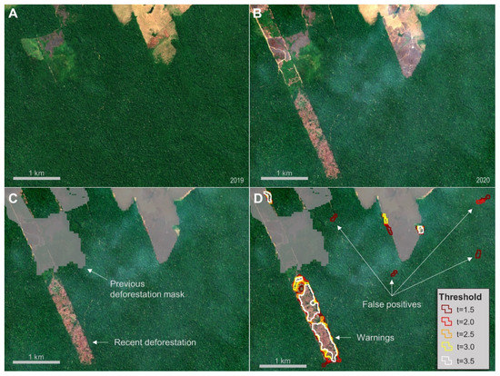
A figure showing how SAR data is used to detect deforestation in the Amazon. Image courtesy of Remote Sensing Division of Instituto Nacional de Pesquisas Espaciais.
Another clear example of the progress being made is SAR data’s ability to analyze icebergs. In 2007, researchers tracked sea ice in the Bering Strait with RADARSAT-1 data. A decade later, processes around deep learning and SAR data made even more detailed analysis possible. In October of 2017, the Statoil/C-CORE Iceberg Classifier Challenge contest used SAR data to help ‘machine learn’ the difference between icebergs and ships as part of an effort to drive down the cost of operating safely. In a similar challenge, efforts utilizing data fusion are underway to map power grids.
As innovations by experts cause end-user costs to fall and accuracy to rise, we can’t help but wonder what the growth of SAR data means for industries far and wide. Next week’s post will explore some of the technology’s potential impacts and legacies.
Geospatial Terms Made Easy: What is MTM?
East View Geospatial (EVG) has been a provider and producer of top-of-the-line maps, charts, geospatial datasets, and models for over 25 years. Spatial data and its derivative products have countless applications, and some of those applications require these products to meet very specific criteria. Maps, charts, and geospatial data used in military operations must adhere to “MTM standards”. We asked Jason Sjolander, our GIS Technical Manager, about MTM specifications and why adhering to standardization is important in the realm of defense mapping.
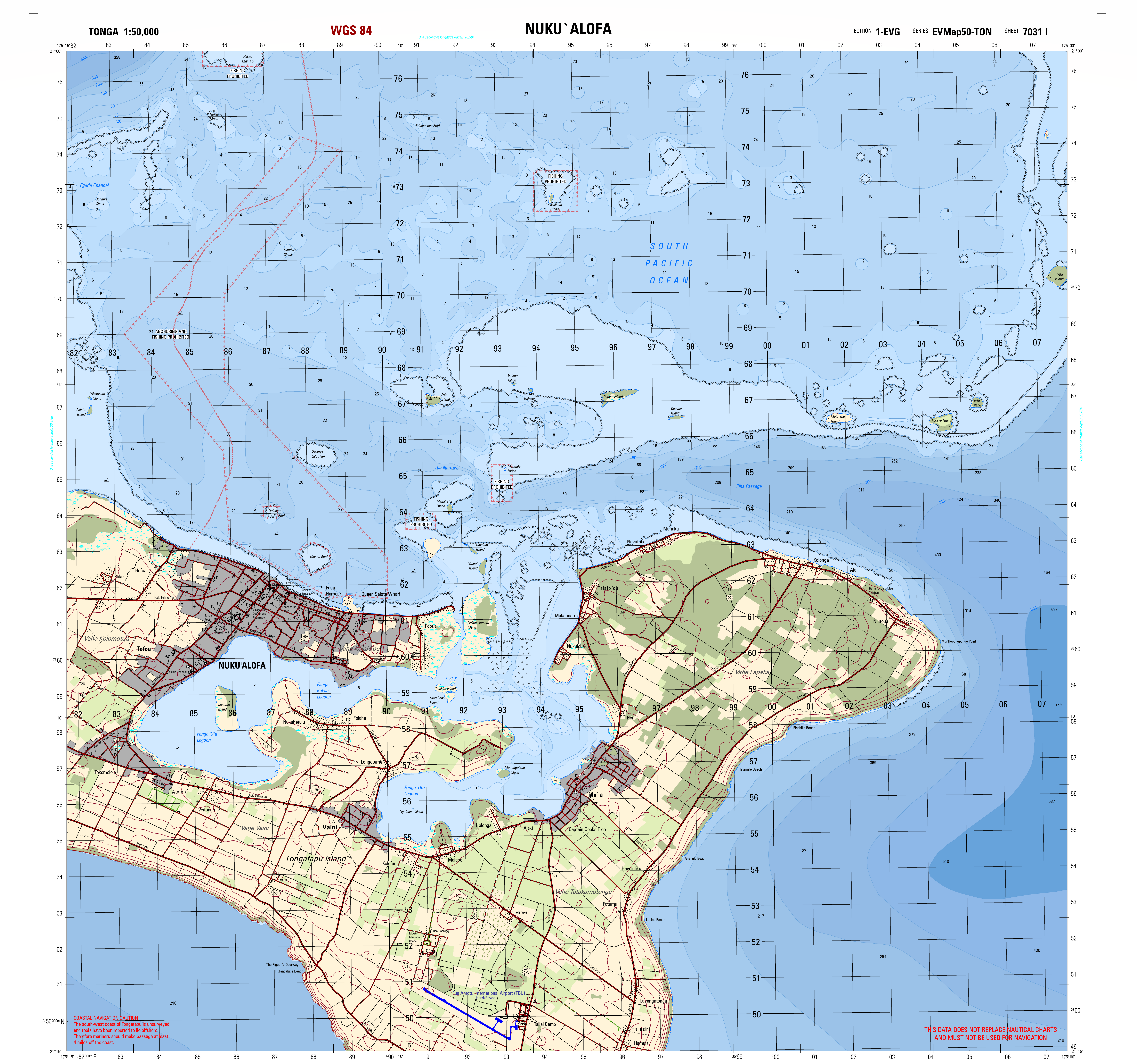
A 1:50,000 scale MTM map of Tonga produced by East View Geospatial.
What is MTM?
“MTM is an acronym of a defense mapping product. Its full name is Multinational Geospatial Co-Production Program Topographic Map. The Multinational Geospatial Co-Production Program or MGCP is a 32+ member group of nations across the world whom contribute information to a central database. This database amongst many things contains GIS data which is used to make MTM’s. Many mapping programs across the world have tools that run exclusively on this MGCP data, most notably ESRI and their Defense Mapping toolset. “
How does this apply to your work at EVG?
“At several points during my career at East View Geospatial, I have created MTMs at both the 50K and 100K scales. Having a standardized map setup like MTM allows for a more efficient workflow and production time and delivers a ready-to-use product to end users. “
Producing MTM maps is just one of the many things we do at EVG. We know how important it is to create maps, charts, datasets, and other geospatial products that meet our clients’ exact needs. We’ll work with you to ensure that the product you need is created to exact specifications no matter the end-use application. Contact us to find out how we can help you utilize maps, charts, and geospatial products today!

Jason Sjolander, GIS Technical Manager
Synthetic Aperture Radar (SAR) 101: Taking Imagery to the Next Level
Synthetic Aperture Radar, or SAR, sees through things that neither the human eye nor electro-optical methods could ever hope to.
Seasat, the first satellite bearing SAR, departed Earth from the Vandenberg Space Launch Complex in California on June 28, 1978. In the decades since, constellations of SAR satellites have been launched and now orbit the planet, taking in data with uses ranging from measuring tiny daily changes in oceans to monitoring economic infrastructure use and aiding disaster relief efforts.
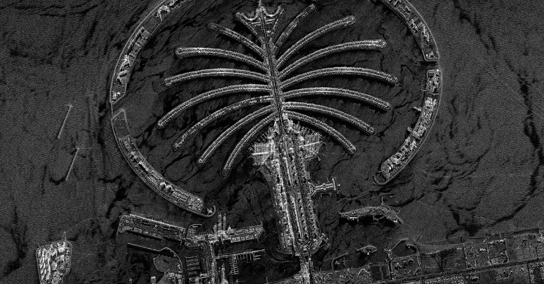
A satellite image compared to a SAR image. Images courtesy of the Dubai Media Office (left) and Capella Space (right).
Like infrared, SAR can penetrate below old barriers like soil, ice, and vegetation. The difference becomes apparent when weather (or worse) rolls in. Traditional electro-optical sensors are rendered blind by clouds, smoke, and at night. SAR sensors are not. They can perform overhead collections in all weather and illumination conditions. A change map that updates as fires rage is a powerful tool against increasingly destructive wildfires in the western United States; the same could be said for oil spills in storms or flooded cities with ongoing rain.
SAR is able to penetrate these things because they are active sensors. The pulses they emit ‘illuminate’ the ground or other surfaces using microwaves. Optical sensors, by contrast, are passive, and rely on sunlight reflecting back from the earth’s surface, which can be blocked by clouds, etc.
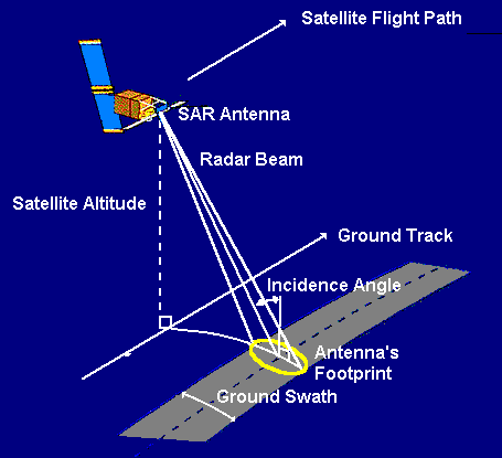
SAR satellites emit their own electronic apertures. These apertures send out pulses and measure the phase, intensity, and time it takes for the signal to return after bouncing off a surface (see diagram to the left, courtesy of Centre for Remote Imaging, Sensing & Processing). Though phase does not resemble traditional imaging data, it collects displacement and height data (another capability optical sensors do not have) and this is useful for interferometry and polarimetry.
SAR shows visual characteristics based on backscatter, which detects change and surface texture. There are three kinds of backscatter; each tells its own story.
Diffuse, or rough, backscatter, indicates mountains or other terrain. Specular reflections occur when a pulse bounces off of a smooth surface, like water or pavement. These regions appear dark in visualizations. Double bounce backscatter is prevalent in urban environments; it occurs when a specular reflection is interrupted by a building or other structure on its way back to the satellite. This results in bright pixels.
SAR instruments use a wide range of band frequencies which determine how the data can be used. Longer wavelengths/lower frequency SAR signals can ‘see’ through matter like vegetation and soil, for example. The frequencies also determine what size features SAR data picks up on. The size of the wave correlates to the size of the object it is supposed to sense; high-frequency bands ‘see’ details like leaves on a tree, while lower frequencies ‘see’ that same tree’s trunk.
The result is a wide range of available scales – from 0.5 meter to 200 km. As a wealth of SAR satellites now inhabit our skies, more and more data is available for free, though much also remains private. This data can be processed in an array of software, from open source tools to standard commercial software like ArcGIS, Gamma, ENVI, and others.
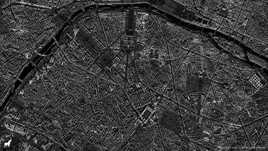
A SAR image of Paris. Image courtesy of Capella Space.
SAR and EO data can also be combined, as the recent SpaceNet6 challenge proved. The contest offered $50,000 in cash prizes to the competitors best able to fuse SAR data with electro-optical imagery courtesy of the Maxar WorldView-2 satellite. The goal of the challenge was to create an image of Rotterdam, The Netherlands. The winners of that challenge (who can be found here) are now among a growing number of people putting the power of SAR front and center in the geospatial world.
Mapping Prejudice: Identifying & Visualizing Racially Restrictive Land Covenants
Discrimination within housing was made illegal under the Civil Rights Act of 1968. However, there are still residual effects from decades of racially biased housing policies in cities all around the United States. Redlining, the federal act of denying mortgages to non-white home buyers, is a well-known discriminatory practice. Another instance of discrimination within housing that is less well known is the implementation of racially restrictive covenants.
A racial covenant (example pictured below) is language that is written into a land deed which prohibits people from owning or living on that property based on race.

Image courtesy of the Mapping Prejudice Project.
Racial covenants are also unique because they are bound to the land and not the structure(s) on that land. The Mapping Prejudice Project (MP), based at the John R. Borchert Map Library in Minneapolis, MN, has made it their mission to identify these racial covenants & illustrate how racist policy shaped the geography of the Twin Cities through data visualization. Many of these covenants still stand today.
Projects to identify racial covenants have been ongoing for years. Segregated Seattle assembled a database of racial covenants, while Mapping Inequality digitized redlining maps to show how policy decisions can seriously impact neighborhoods. MP created a database of racial covenants in Hennepin County, Minnesota. In 2016, the MP team created the first-ever time-lapse visualization of racial covenants in Minneapolis, allowing people to see exactly where and when this discrimination occurred. The project has since grown to include racial covenants in neighboring Ramsey County, where state capitol St. Paul is located.
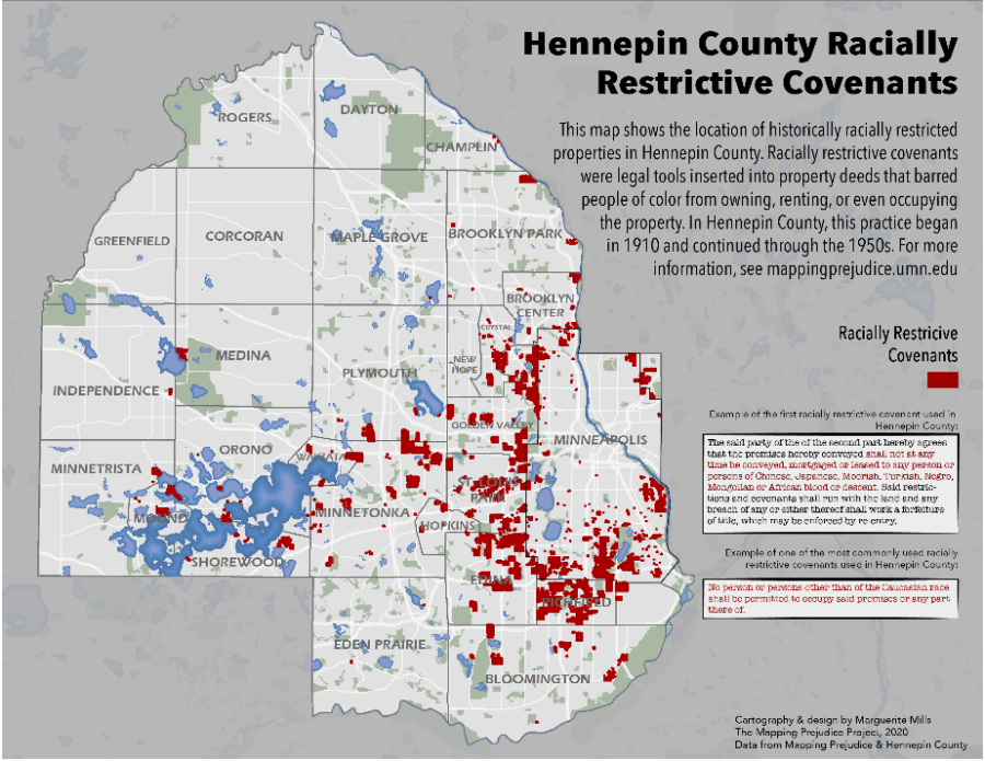
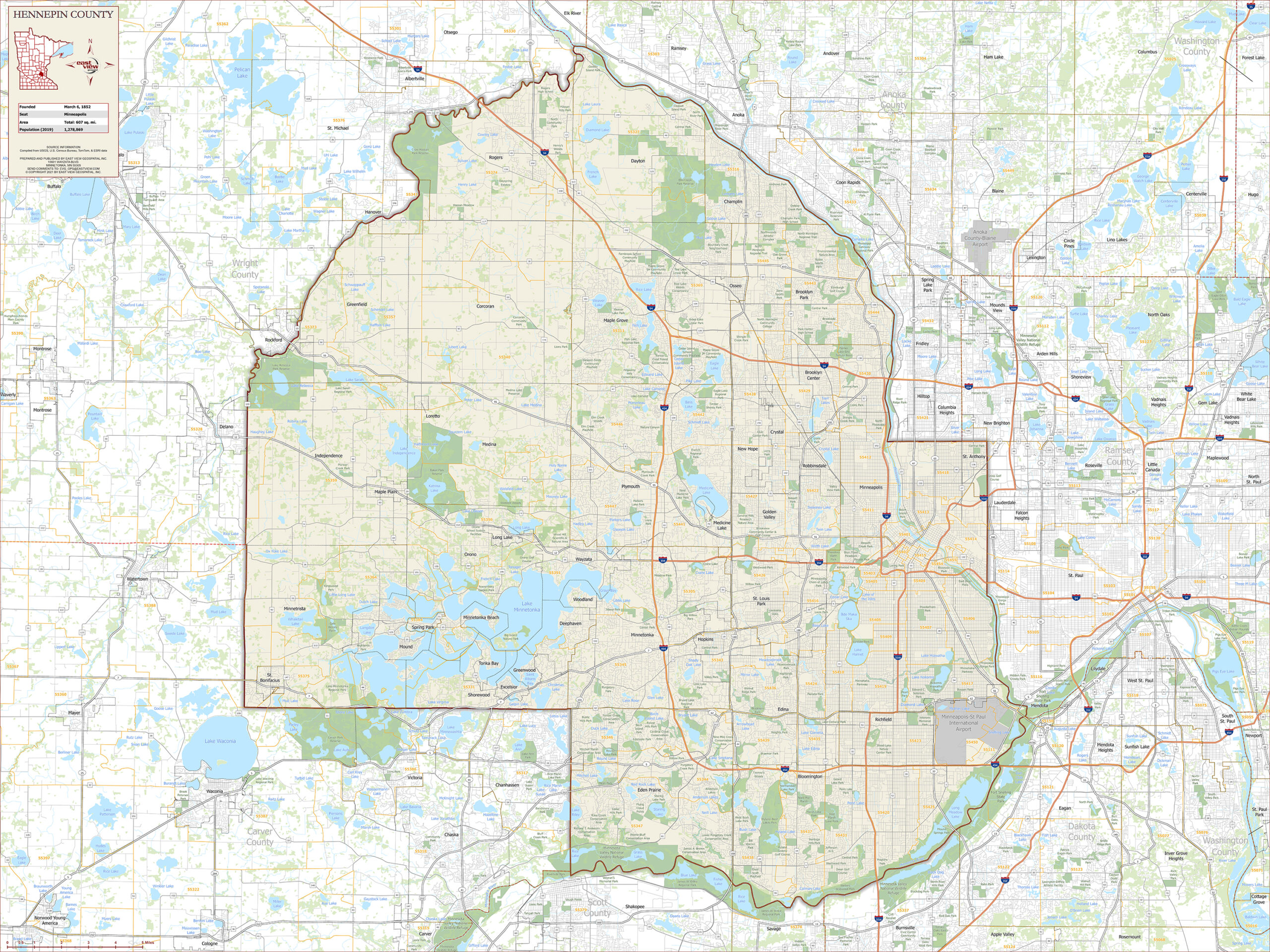
The distribution of known racially covenants in Hennepin County, Minnesota. Map courtesy of Marguerite Mills & the Mapping Prejudice Project.
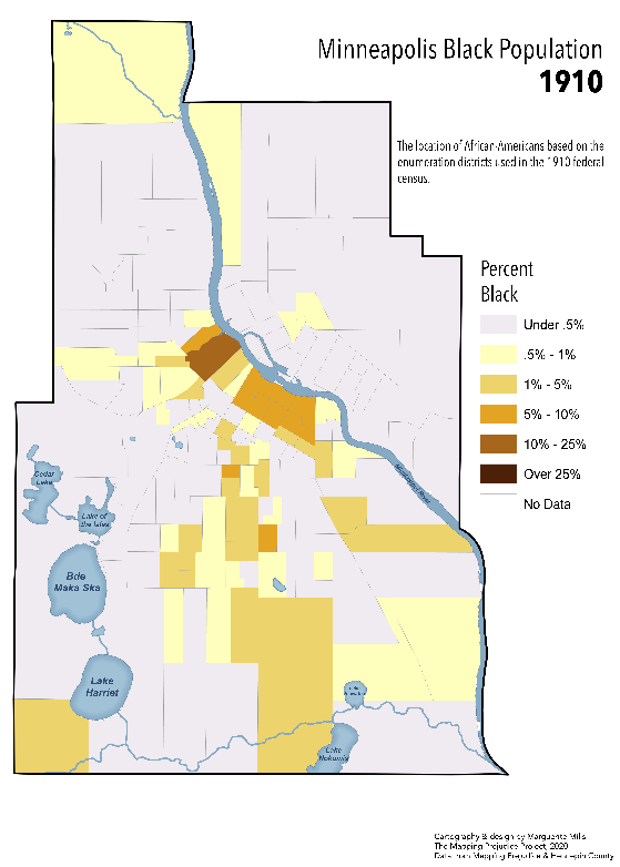
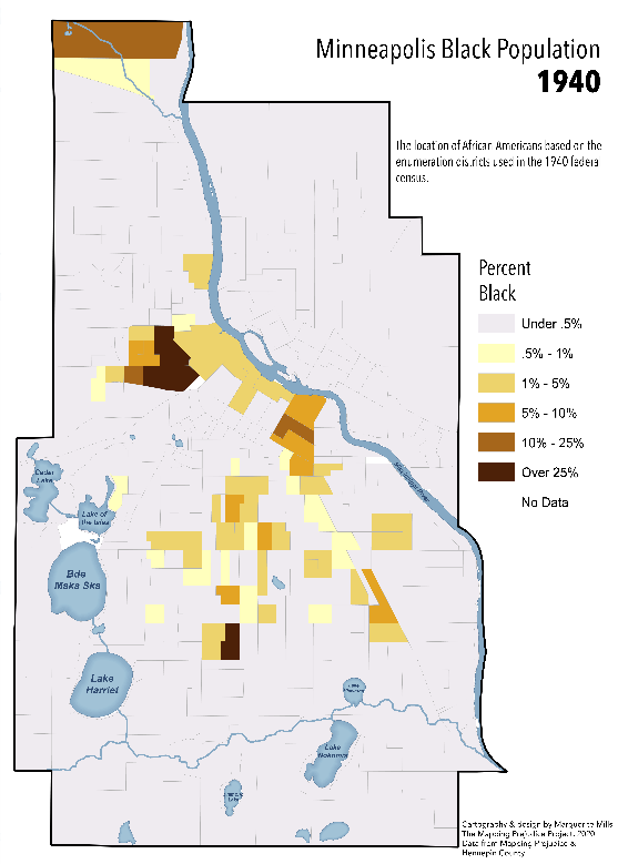
To give some background, in 1910, the city of Minneapolis was relatively integrated, as many northern cities were at the time. There were several families of color in many different areas of the city. By 1940, however, almost all families of color were concentrated into a few neighborhoods in Minneapolis, even though there was no drastic influx of new people/families of color to the greater Twin Cities area. Non-white families were forced to live in these areas due to widespread implementation of racial covenants in land deeds (see images below).
African-American families in Minneapolis in 1910 and 1940. Maps courtesy of Marguerite Mills & the Mapping Prejudice Project.
The way racial covenants work is that the initial person who places the covenant on the property can “reclaim” the property if the covenant should be broken. If a property is bought or leased by a person or family of color after the covenant is placed but the original property owner comes forward, the family of color loses the property and all equity accumulated. The property then reverts to the initial owner (or an heir/descendant of the original owner if they are no longer alive). Legally, covenants are extremely difficult to undo, but Minnesota Governor Tim Walz signed a bill into law in June of 2019 that allows homeowners to disavow racial covenants associated with their property. The Mapping Prejudice Project has inspired many residents of Hennepin & Ramsey counties to investigate if their property has a racial covenant & disavow the language if a covenant is identified.
Currently, over 24,000 racially restrictive covenants have been identified & mapped within Hennepin County alone. There are still more within Hennepin County to be identified, and the Mapping Prejudice Project has begun to identify racial covenants in Ramsey County as well. You can help the MPP team identify covenants virtually! After completing the training video, you’ll be able to identify and report racially restrictive housing covenants in digitized deeds. Find out more about getting involved here.
Though racial covenants have been illegal for over 50 years, they continue to impact people through the ways they shaped the geographies of cities. The research done by the Mapping Prejudice Project team has clearly illustrated that current inequalities stem from past racist policies and blatant discrimination. Through awareness & education, The Mapping Prejudice Project strives to create a more just and equitable future.
The Blue Swoosh and The Black Belt: At the Cross-Section of Geology and Human Geography
Diverse data can keep us updated on current events, informed about natural disasters, and entertained… but it also has the power to tell stories that span across centuries.
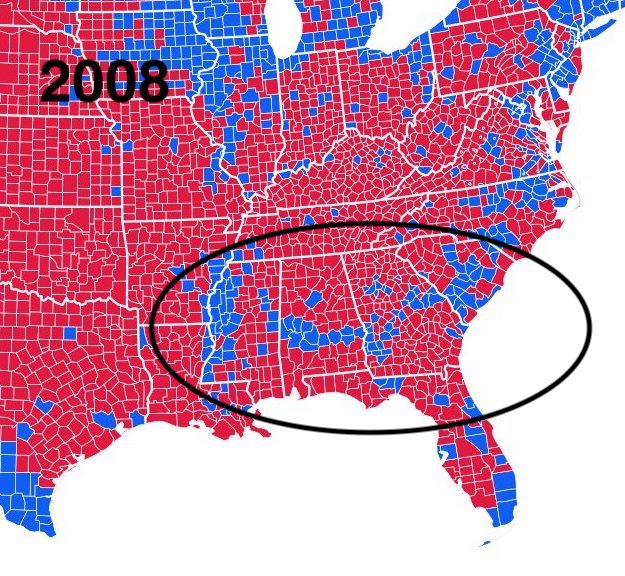
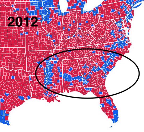
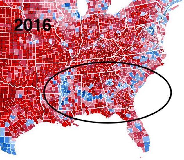
Take the case of a recurring, curious ‘blue swoosh’ of Democratic voters in the United States’ traditionally Republican deep south. The shape and location of this swoosh match up nearly exactly with the shape of the ancient shoreline that once existed in the same place. Using historic political results, population data, and geographic features, researchers have shown a link between ancient plankton and modern electoral dynamics.
Image courtesy of Inqvisitor & Ali Zifan CC BY-SA 4.0
n a Twitter thread following the 2020 US Presidential election, RadioLab co-host Latif Nasser outlined how, after national elections, a ‘blue swoosh’ of pro-Democrat counties cuts through the otherwise deep-red of the American South. That swoosh just so happens to correspond with another swoosh – an area of land known as “the black belt” which originally referred to the region’s rich, black topsoil and ideal farmland.
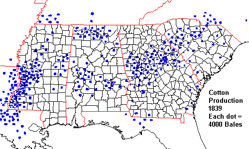
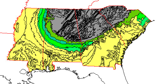
Images courtesy of Dr. Steven Dutch, University of Wisconsin-Green Bay
Nasser credits Robert Krulwich with the insight, thanks to his 2012 NPR article, Obama’s Secret Weapon In The South: Small, Dead, But Still Kickin’. Krulwich was hardly the first to notice the electoral quirk, however. In a 2002 article, Steven Dutch, Professor Emeritus, Natural and Applied Sciences at University of Wisconsin Green Bay found his interest piqued by the subject.
In the 2000 contest between Republican George W. Bush and Democrat Al Gore, Dutch noticed the arc-shaped island of support for Gore in the otherwise deep red south. He also noticed that Gore support corresponded almost exactly to a band of rock outcroppings, which he proved by overlaying a geologic map and a map of election results. Using population data, county boundaries, election results, and earth-science features, he was able to convincingly show a correlation between ancient geology and contemporary human politics.
As a geologist, Dutch knew that millions of years ago, what is known today as the USA’s “deep south” was a shoreline populated with an abundance of plankton with carbonate skeletons. When they died, their bodies sank, and over millennia, they became chalk. Then sea levels dropped, and the seafloor became land. The chalk became rich, fertile soil – perfect for growing cotton. And it was only located in the ‘swoosh’ zone.
When plantation owners flooded into the area to make use of its soil, they brought scores of slaves with them to do the actual work. Slavery was eventually abolished, but many ex-slaves continued to live where they were. As a result, enough Black voters live in those counties to sway election results as a bloc. This is where scientists believe the ‘blue swoosh’ comes from.
Without those plankton, forced migration into that area would look vastly different. Without diverse data and GIS, the complete picture of their unwitting influence may have never come to light.

