The Critical Role of Spatial Data in COVID-19 Vaccination
Key Takeaways
- In COVID-19 vaccination efforts, leveraging spatial information is essential in planning, distribution and post-vaccination tracking
- In the planning phase, spatial data helps identify vaccine distribution sites and priority populations
- Following vaccination, spatial information can be used to track how many people have received doses and predict when populations will reach herd immunity
- GIS can be used to boost the transparency of vaccination efforts to promote greater public trust
In the battle against COVID-19, developing a vaccine was one step toward victory. Now the world needs logistics experts to distribute the vaccines accurately, equitably, and quickly. Location-based data analysis has proven to be an essential tool for these experts.
The Centers for Disease Control (CDC) and miscellaneous health groups have been using spatial data since the onset of the pandemic. In a recent article on GovConWire, chief of commercial mission integration at the US’ National Geospatial-Intelligence Agency (NGA) Juan Sainz noted that geospatial data usage increased by over 100% and there was an influx of new users since COVID-19’s arrival in the winter of 2020.
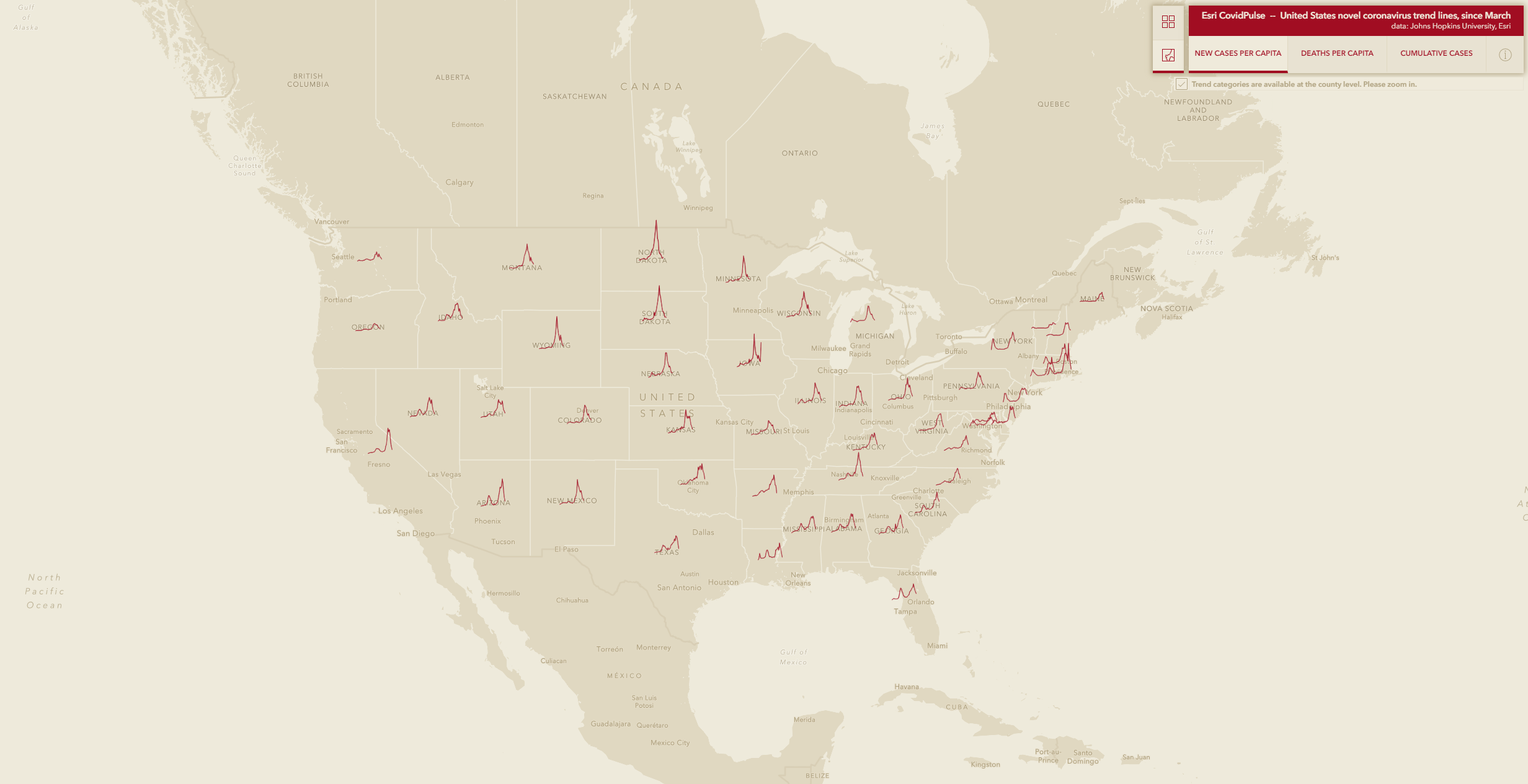
Esri’s CovidPulse Dashboard (above) shows new cases per capita in each state. Image courtesy of Esri.
As we noted in a previous post, GIS tools like Esri’s CovidPulse Dashboard and the Johns Hopkins University tracking dashboard have helped with monitoring the spread of the virus. Other tools were used to distribute tests, like at Mayo Clinic’s Jacksonville, Florida campus, where autonomous vehicles delivered COVID-19 tests and medical supplies.
In distribution efforts, similar tools can be put to use for planning, tracking, and publicizing vaccine progress. GIS is well-suited as a tool for addressing location-based needs specific to vaccination efforts. By using different types of spatial data, vaccination efforts can be adjusted region by region or even city by city.
GIS’s ability to incorporate layered data means it is an excellent resource when finding and assigning vaccine administration sites. It can help to identify locations where ample cold storage exists while also identifying facility staffing levels and capacity for parking and foot traffic.
Decision-makers can plan for many different scenarios by leveraging spatial data. Knowing ahead of time what situations might cause cold storage to become limited, or where adverse weather conditions could spoil vaccine doses is invaluable information.
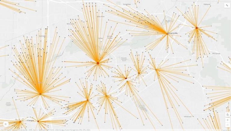
Spatial data is key to planning for optimal vaccine distribution. This is a sample vaccine venue map in which red dots indicate capacity for ultra-cold storage, and yellow dots indicate normal cold storage. Dot size indicates overall capacity. Lines represent drive time and distance to the potential distribution site from various population centers. Image courtesy of Esri.
Utilizing GIS in the planning stage also means decision-makers can learn where priority populations reside and design a vaccine distribution plan suited to reach them. Population data, layered under infrastructure data, can be used to ensure the most accessible sites are chosen. Physical distance may not always be the best indicator of accessibility, either – many datasets include information like bus routes, construction information, and languages preferences, among other factors that contribute to accessibility.
Once vaccines are being delivered and administered, location-based information can help develop a tracking system for who has taken both doses of the vaccine, as well as inventory management systems. This will decrease both confusion and wasted doses of the precious vaccines. This aspect also plays into a another important aspect of vaccine distribution: transparency.
Esri’s public-facing solution for the COVID vaccine, called the Coronavirus Vaccine Outreach solution, functions as a window into vaccination progress. It can be used to informally track progress, but also to illustrate official decisions and the rationale behind them. Official announcements paired with visible data help create a path toward greater trust between communities and their leaders. These kinds of solutions can also help individuals determine their eligibility for vaccination and find the best location to receive one, should they qualify.
Mapping Prejudice: Identifying & Visualizing Racially Restrictive Land Covenants
Discrimination within housing was made illegal under the Civil Rights Act of 1968. However, there are still residual effects from decades of racially biased housing policies in cities all around the United States. Redlining, the federal act of denying mortgages to non-white home buyers, is a well-known discriminatory practice. Another instance of discrimination within housing that is less well known is the implementation of racially restrictive covenants.
A racial covenant (example pictured below) is language that is written into a land deed which prohibits people from owning or living on that property based on race.

Image courtesy of the Mapping Prejudice Project.
Racial covenants are also unique because they are bound to the land and not the structure(s) on that land. The Mapping Prejudice Project (MP), based at the John R. Borchert Map Library in Minneapolis, MN, has made it their mission to identify these racial covenants & illustrate how racist policy shaped the geography of the Twin Cities through data visualization. Many of these covenants still stand today.
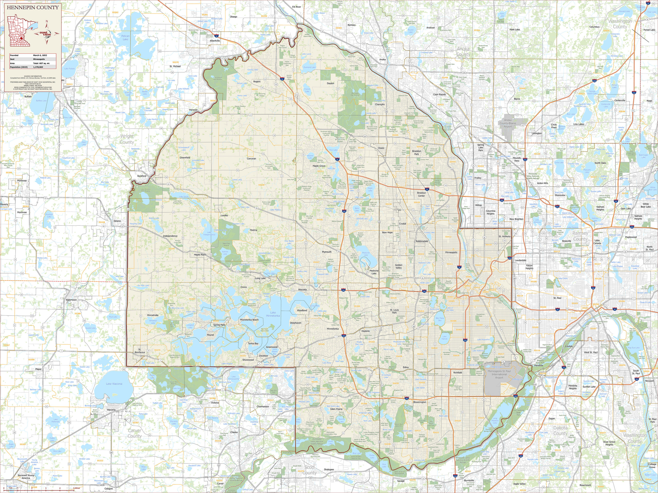
Projects to identify racial covenants have been ongoing for years. Segregated Seattle assembled a database of racial covenants, while Mapping Inequality digitized redlining maps to show how policy decisions can seriously impact neighborhoods. MP created a database of racial covenants in Hennepin County, Minnesota. In 2016, the MP team created the first-ever time-lapse visualization of racial covenants in Minneapolis, allowing people to see exactly where and when this discrimination occurred. The project has since grown to include racial covenants in neighboring Ramsey County, where state capitol St. Paul is located.
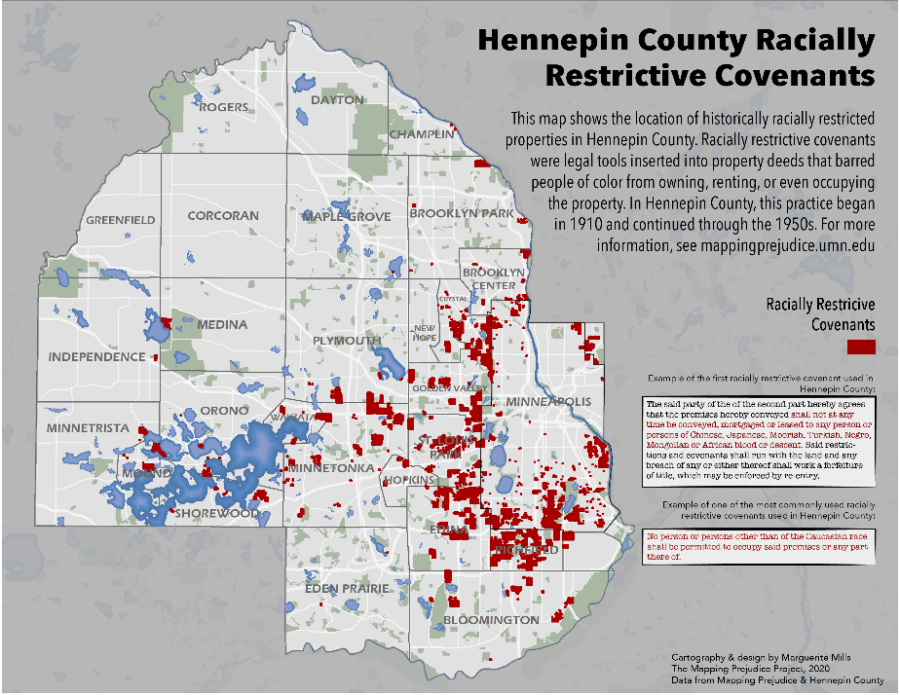
The distribution of known racially covenants in Hennepin County, Minnesota. Map courtesy of Marguerite Mills & the Mapping Prejudice Project.
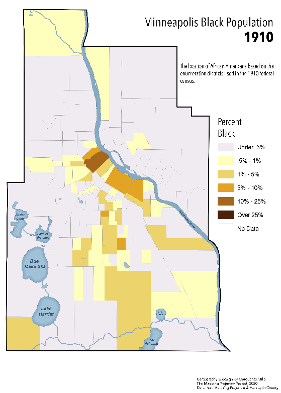
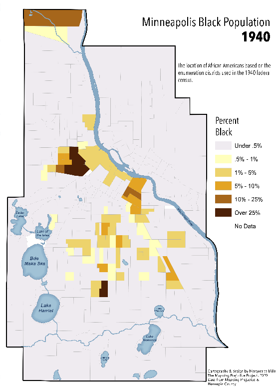
To give some background, in 1910, the city of Minneapolis was relatively integrated, as many northern cities were at the time. There were several families of color in many different areas of the city. By 1940, however, almost all families of color were concentrated into a few neighborhoods in Minneapolis, even though there was no drastic influx of new people/families of color to the greater Twin Cities area. Non-white families were forced to live in these areas due to widespread implementation of racial covenants in land deeds (see images below).
African-American families in Minneapolis in 1910 and 1940. Maps courtesy of Marguerite Mills & the Mapping Prejudice Project.
The way racial covenants work is that the initial person who places the covenant on the property can “reclaim” the property if the covenant should be broken. If a property is bought or leased by a person or family of color after the covenant is placed but the original property owner comes forward, the family of color loses the property and all equity accumulated. The property then reverts to the initial owner (or an heir/descendant of the original owner if they are no longer alive). Legally, covenants are extremely difficult to undo, but Minnesota Governor Tim Walz signed a bill into law in June of 2019 that allows homeowners to disavow racial covenants associated with their property. The Mapping Prejudice Project has inspired many residents of Hennepin & Ramsey counties to investigate if their property has a racial covenant & disavow the language if a covenant is identified.
Currently, over 24,000 racially restrictive covenants have been identified & mapped within Hennepin County alone. There are still more within Hennepin County to be identified, and the Mapping Prejudice Project has begun to identify racial covenants in Ramsey County as well. You can help the MPP team identify covenants virtually! After completing the training video, you’ll be able to identify and report racially restrictive housing covenants in digitized deeds. Find out more about getting involved here.
Though racial covenants have been illegal for over 50 years, they continue to impact people through the ways they shaped the geographies of cities. The research done by the Mapping Prejudice Project team has clearly illustrated that current inequalities stem from past racist policies and blatant discrimination. Through awareness & education, The Mapping Prejudice Project strives to create a more just and equitable future.
The Blue Swoosh and The Black Belt: At the Cross-Section of Geology and Human Geography
Diverse data can keep us updated on current events, informed about natural disasters, and entertained… but it also has the power to tell stories that span across centuries.
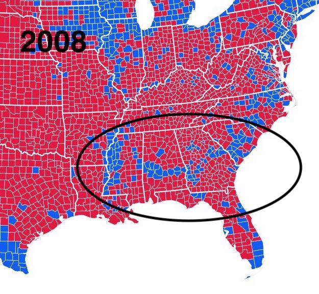
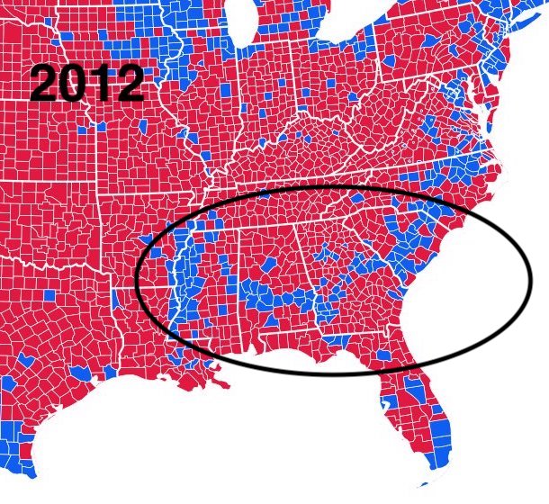
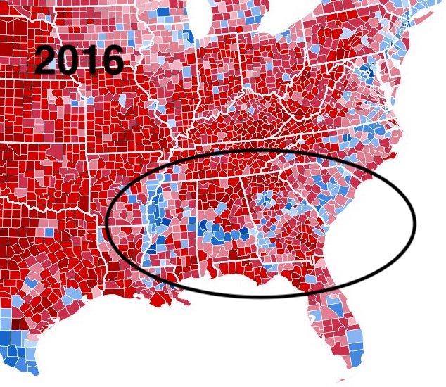
Take the case of a recurring, curious ‘blue swoosh’ of Democratic voters in the United States’ traditionally Republican deep south. The shape and location of this swoosh match up nearly exactly with the shape of the ancient shoreline that once existed in the same place. Using historic political results, population data, and geographic features, researchers have shown a link between ancient plankton and modern electoral dynamics.
Image courtesy of Inqvisitor & Ali Zifan CC BY-SA 4.0
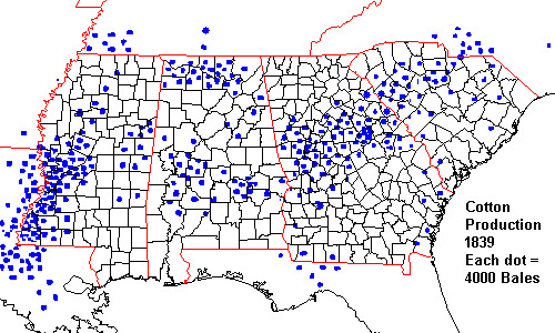
n a Twitter thread following the 2020 US Presidential election, RadioLab co-host Latif Nasser outlined how, after national elections, a ‘blue swoosh’ of pro-Democrat counties cuts through the otherwise deep-red of the American South. That swoosh just so happens to correspond with another swoosh – an area of land known as “the black belt” which originally referred to the region’s rich, black topsoil and ideal farmland.
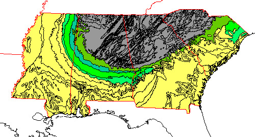
Images courtesy of Dr. Steven Dutch, University of Wisconsin-Green Bay
Nasser credits Robert Krulwich with the insight, thanks to his 2012 NPR article, Obama’s Secret Weapon In The South: Small, Dead, But Still Kickin’. Krulwich was hardly the first to notice the electoral quirk, however. In a 2002 article, Steven Dutch, Professor Emeritus, Natural and Applied Sciences at University of Wisconsin Green Bay found his interest piqued by the subject.
In the 2000 contest between Republican George W. Bush and Democrat Al Gore, Dutch noticed the arc-shaped island of support for Gore in the otherwise deep red south. He also noticed that Gore support corresponded almost exactly to a band of rock outcroppings, which he proved by overlaying a geologic map and a map of election results. Using population data, county boundaries, election results, and earth-science features, he was able to convincingly show a correlation between ancient geology and contemporary human politics.
As a geologist, Dutch knew that millions of years ago, what is known today as the USA’s “deep south” was a shoreline populated with an abundance of plankton with carbonate skeletons. When they died, their bodies sank, and over millennia, they became chalk. Then sea levels dropped, and the seafloor became land. The chalk became rich, fertile soil – perfect for growing cotton. And it was only located in the ‘swoosh’ zone.
When plantation owners flooded into the area to make use of its soil, they brought scores of slaves with them to do the actual work. Slavery was eventually abolished, but many ex-slaves continued to live where they were. As a result, enough Black voters live in those counties to sway election results as a bloc. This is where scientists believe the ‘blue swoosh’ comes from.
Without those plankton, forced migration into that area would look vastly different. Without diverse data and GIS, the complete picture of their unwitting influence may have never come to light.
ShotSpotter: Using Geospatial Technology To Create a Safer World
Location-based data continues to evolve and with this evolution comes game-changing innovation. Recently, geospatial data has been instrumental in developing ShotSpotter, a new technology that detects gunfire almost immediately and alerts authorities, allowing for faster emergency response times.
ShotSpotter works by using stationary acoustic sensors. These sensors are mounted on buildings and other structures throughout a city. The software within the sensors filters out white noise- like wind or automobile sounds. In order for a noise to potentially be considered a gunshot, three sensors must be triggered. The time it takes for the sound to reach the sensors is used to effectively triangulate a precise location of where the shots were fired.
Software within the sensors also compares the detected sound with a library of known gunfire sounds. If the sound matches and is classified as “likely gunfire”, it is sent to the ShotSpotter Incident Review Center to determine whether the authorities need to be notified. Once the sound has been reviewed by the Incident Review Center and has been classified as gunfire, alerts are sent to the local authorities via the ShotSpotter mobile, desktop, and browser apps, allowing police to access the data from anywhere. Although it may seem like a lengthy process, the entire chain of events, from gunfire to alert of authorities, takes place in less than a minute!
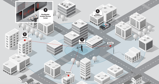
Image courtesy of ShotSpotter.
Precise location data is necessary to ensure police can respond quickly to the exact area the gunfire incident occurred. In addition to helping authorities on the ground, ShotSpotter has been utilized in the courtroom as evidence. Each noise incident recorded on ShotSpotter is timestamped and georeferenced, which can be crucial when constructing a timeline of events.
Technology like ShotSpotter is making the world a safer place, and it relies on geospatial data to do so. Currently, over 100 U.S. cities use ShotSpotter, and that number continues to grow. ShotSpotter is yet another example of how geospatial data can be leveraged to make the world a better place to be. To learn more about how geospatial information is used in litigation, check out this blog post.
Are All Maps Created Equal?
We have previously written about the way maps can shape people’s conception of reality. That dynamic holds true in the realm of politics, too – especially during a national election.
In the United States last week, as election results for the national presidential contest started coming in, broadcast television became a torrent of maps. On this night, the map is the star of the show – as the protagonist or antagonist depends on your political persuasion. More importantly, these maps, used by anchors and correspondents to aid the electorate in visualizing the results, are all data-driven and powered by GIS technology. The most ubiquitous variety is a flat choropleth map. This is the now-familiar thematic map of the states color-coded according to which party their popular votes go for.
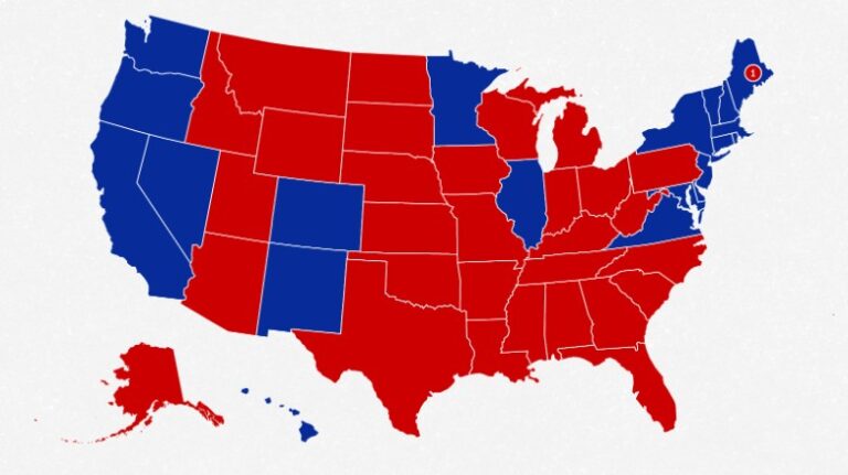
A choropleth map of electoral college results from the 2016 U.S. Presidential election. Map courtesy of CNN.
The electoral college system dictates that Americans’ votes are tallied state by state. Winners receive points, known as electoral votes, for the states they win. These flat maps, with (usually) large swaths of red dominating states with larger territory than populations are how most Americans mentally organize the political landscape of their county. The real picture, however, is far more nuanced.
While flat, color-coded choropleth maps depict the differences in state-to-state political outcomes, they cannot accurately represent outcomes in terms of actual percentage of population. In these cases, maps that emphasize population, rather than district boundaries, can be better visualizations of the national situation.
One option is a cartogram, a map where a variable like population or income is used instead of land area. In the case of US elections, a cartogram representation would distort the familiar shape of the continental United States into shapes that reflect numbers of voters instead. The swirling lines of Ersi cartographer Kenneth Field’s 2016 contiguous cartogram shows that effect.
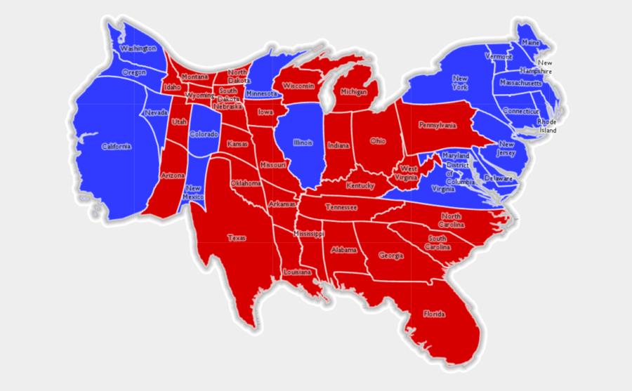
A contiguous cartogram of the 2016 U.S. Presidential election results created by Esri.
In 2016, Field created a variety of thematic maps of the 2016 presidential election. These range from traditional to borderline-fantastical (one map allows for a layer of Star Wars Tie Fighters to appear). In some, the difference comes down to symbology such as color or texture. His choropleth unclassed blended hue map takes a flat map and breaks it into voting districts. The result is a more visually diverse representation than when single colors are applied state-by-state.
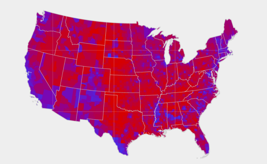
A blended choropleth map of the results of the 2016 U.S. Presidential election. Map courtesy of Esri.
These advances in mapping are not the first time the American population has seen an enhanced ability to break down its election results. After the 1880 presidential election, Harry Gannett, census superintendent, drew a map that broke down results in a district-by-district way. This shifted the thinking about the political solidarity of states.
Will election maps on TV look any different come 2022? Potentially, though the flat choropleth map does have one advantage: it’s can be easily interpreted even when the TV is muted.

