Mapping Efforts Move Forward in the Age of a Pandemic
Doing business in the era of COVID-19 means navigating around office closures, travel restrictions, and other roadblocks. For cartographers & GIS teams, who often work in a collaborative environment, and by leveraging large datasets sitting on local servers, this reality could present major problems.
Thankfully, current technology and strong, pre-existing relationships between data providers and map publishers worldwide allow for remote work where it was once not feasible. This has kept an essential industry running in uncertain times.
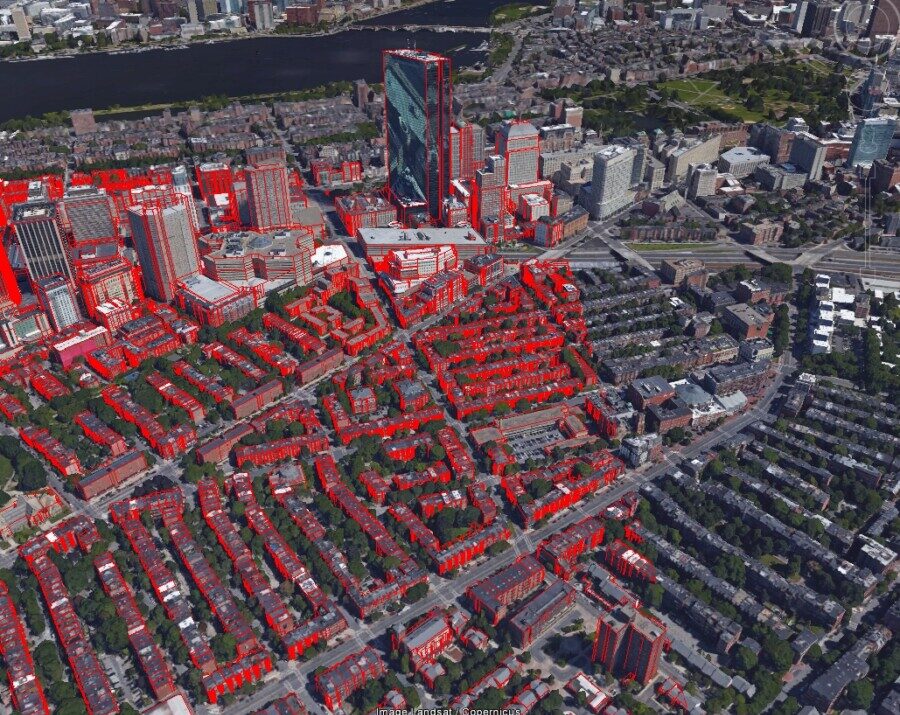
The East View Geospatial cartographic team found itself at the forefront of this phenomenon earlier this year when it produced mapping of the Polynesian island nation of Samoa.
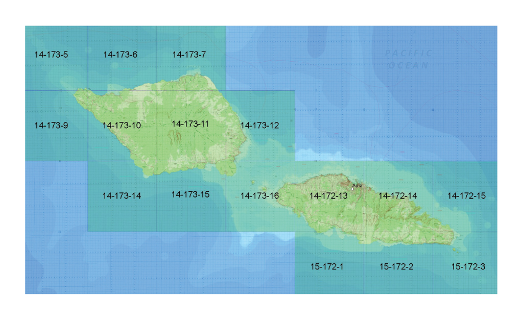 The mosaic of all 16 sheets over Samoa produced by EVG.
Just prior to its work in Samoa, the EVG production team published 16 topographic maps over Tanzania after identifying gaps in the series’ coverage. This effort thereby helped complete the Tanzania 1:50,000 topographic map series for the first time in the nation’s history (this story map tells that story).


In their efforts to execute the map production efficiently, accurately and up to MTM Mil-Spec requirements, the team utilized a suite of workflow enhancement tools developed by the Esri Defense Mapping Team, just as they had in their Tanzania work. These tools streamlined the production process and the team’s expertise with said technology made the completion of the Samoan map series possible.
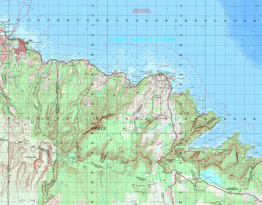
One of the topographic map sheets over Samoa produced by the EVG cartographic team.
In the end, our cartographic team produced & published a series of 1:50,000 scale topographic mapping comprised of 16 map sheets over Samoa. This series is the most recent addition to the EVMap catalog that includes datasets over Tanzania, Nigeria, Mexico and Myanmar. The production of this map series was executed 100% remotely and completed in 50% of the time estimated.
Mapping in the era of COVID may come with complications, but with the right tools in the right hands, precise, ground-breaking mapping projects can seamlessly move forward.
Watch the short video below to see how the EVG cartographic team mapped Samoa in the age of a pandemic:
Wandering in the World of Open Source Data
There is more data in the palms of our hands than ever before, and even for industries built on selling access to now-free information, there is a silver lining. Access to publicly available data is heightening everyone’s imaginations, and, in doing so, is stimulating demand for further expertise in data science and technology to harness its full potential.
For specific outcomes, though, expertise is needed. Many companies and individuals, while cognizant of this open data revolution in which we find ourselves, still need assistance in both sourcing the appropriate data as well as leveraging it to reap intended outcomes. To illustrate the demand for and value of data science and technology expertise, detailed below are recent projects leveraging open-source data.
Building height data produced by EVG, shown in red, compared to real building size to show accuracy.
Satellite and aerial imagery represent another data type that has become exponentially more pervasive in the public domain, and these remotely sensed datasets can enable the creation of innumerable derivative products and applications. Good examples of these include satellite-borne images from the Landsat Missions, made available through NASA and USGS, and Sentinel-2, made available through the European Space Agency. Many are unaware of the existence of such imagery. Or, even if they are aware, they may struggle to exploit the data into meaningful outcomes. That’s where solution providers, like East View Geospatial, come into play.
In another notable case, EVG was able to utilize Landsat imagery over Costa Rica from 2015-2018 to perform a detailed change detection study on behalf of our client. This publicly available imagery allowed us to quickly analyze land cover and canopy changes over the country during a time when Costa Rica had experienced two major hurricanes. The data outputs we provided allowed the client to evaluate the extent of the environmental impact as well as their post-disaster response.
Satellite imagery over Costa Rica compared to land use/land cover data over the same area.
In both cases, EVG’s knowledge of public data & access to difficult-to-source data through National Mapping Agencies combined with our technical expertise enabled an agile solution. Aggregating free data, analyzing, conflating it with other datasets and delivering on a plan of action is something that has become integral to our operation since its inception. Growing access to free data has ushered out many traditional models of selling data but, most importantly, it has presented new opportunities to bring forth creative solutions to today’s most difficult challenges.
Geospatial Technology: Visualizing, Predicting, and Reacting to Large-Scale Disasters
As complex spatial data and GIS have grown more and more ubiquitous, so too has the public’s ability to better comprehend events happening time zones away from them. Likewise, the rise of such technology has also improved people’s ability to react when disasters strike close to home.
In August, a deadly explosion in Beirut captured the attention of the globe. Footage of the event spread rapidly over social media, but for many, understanding the magnitude of a blast in a city they have never visited was made possible with diverse visualizations like those in a New York Times article. In one image, circles representing the blast radius are overlaid on top population density data. In another, satellite imagery of the city is overlaid with data points like kinds of damage reported (from leveled buildings close to the explosion to blown-out windows miles away from its center) and other information specific to individual neighborhoods.
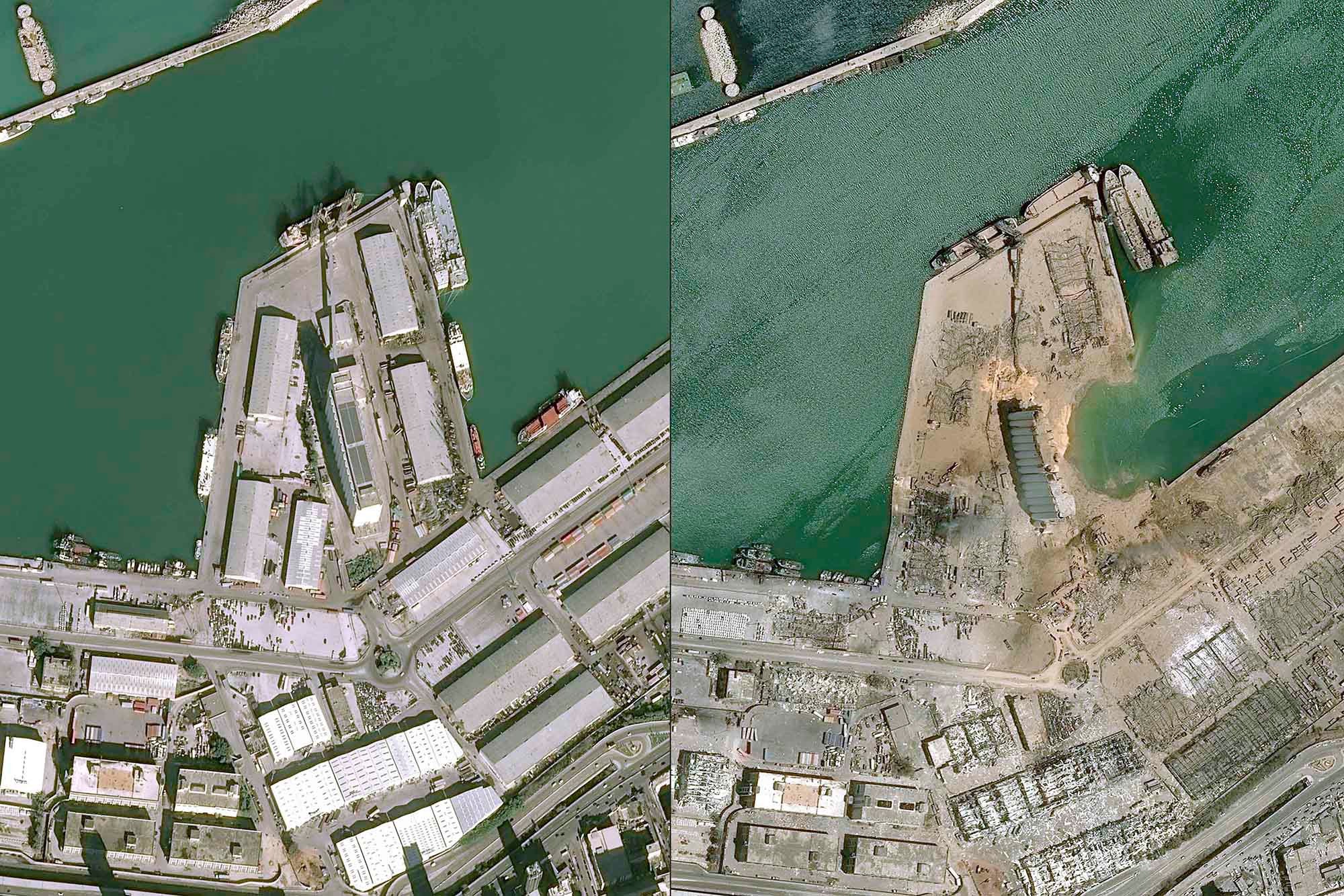
Image courtesy of the New York Post.
Other large-scale natural disasters, like wildfires, hurricanes, floods, landslides, and air pollution, are often difficult for individuals to truly comprehend but also necessary to react to, in both the immediate and long-term. GIS allows multiple forms of data to overlap and paint a clear picture of both the physical and socio-economic impacts of a disaster.
In the United States, the Federal Emergency Management Agency’s Hurricane Incident Journal keeps tabs on both the severity of an approaching storm and how much potential harm already-disadvantaged populations may face. National Oceanic and Atmospheric Administration (NOAA) data projecting the path of storms is conflated with data from the CDC’s Social Vulnerability Index. For 2020’s Hurricane Laura, COVID-19 case data from Johns Hopkins University was also added to that mix. The United States Army Corp of Engineers’ Flood Inundation Mapping project provides an interactive map with levels of information from stream gauges and levee information to help predict where floods may strike afterward.
Image courtesy of WDSU News.
Similar tools exist for tracking wildfires, like those currently ravaging the west coast of the US. The United States Geological Survey’s (USGS) Landfire Data Distribution Site tracks fires in real-time, as do several other non-state organizations. Advances in unmanned air vehicles and the Internet of Things have allowed for more rapid updates with less risk to humans.
Recently, Google has added data to ensure that these kinds of apps can continue to be frequently updated and rapidly accessed, meaning the tools stay useable even as demand for them increases with the advent of a disaster.
After fires burn through the vegetation that, quite literally, holds land together, landslides are a common occurrence. The United States Geological Survey (USGS) has tools to monitor those threats in real-time, including landslide monitoring and post-fire debris flows, and informational guides for understanding the maps. The USGS also provides similar tools for earthquakes. This data is created in cooperation with institutions like the Colorado School of Mines.
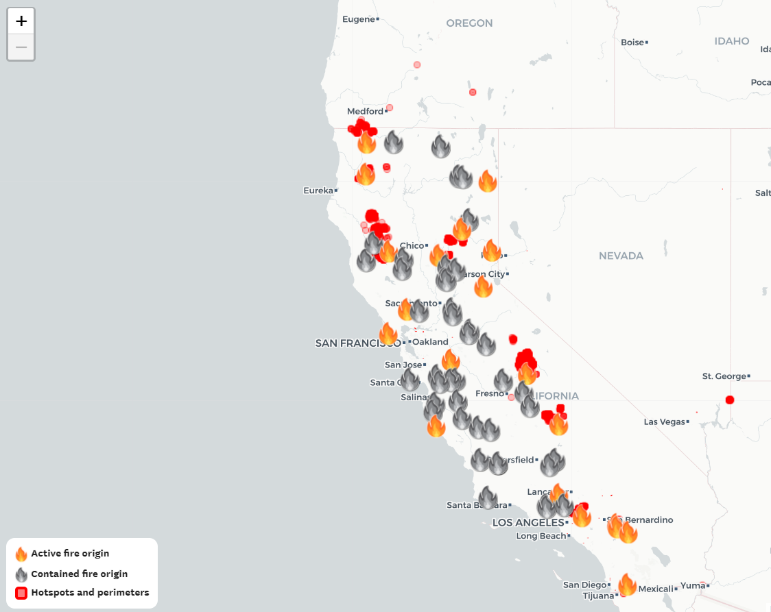
Image courtesy of The San Francisco Chronicle.
Of course, since this is spatial data, there are non-governmental actors providing knowledge as well. One example is PurpleAir, an air quality tracking site created using the Internet of Things, including devices you can buy on-site to monitor air around your home and contribute to the overall data. For a non-governmental live look at developing storms, Esri’s disaster response hub houses a wealth of tools.
Geospatial data continues to play a crucial role in not only tracking & responding to a natural disaster but also informing the public on the gravity of the situation. The tools and visualizations made available by geospatial data and GIS software continue to provide key insights and information for decision-makers and laypeople alike.
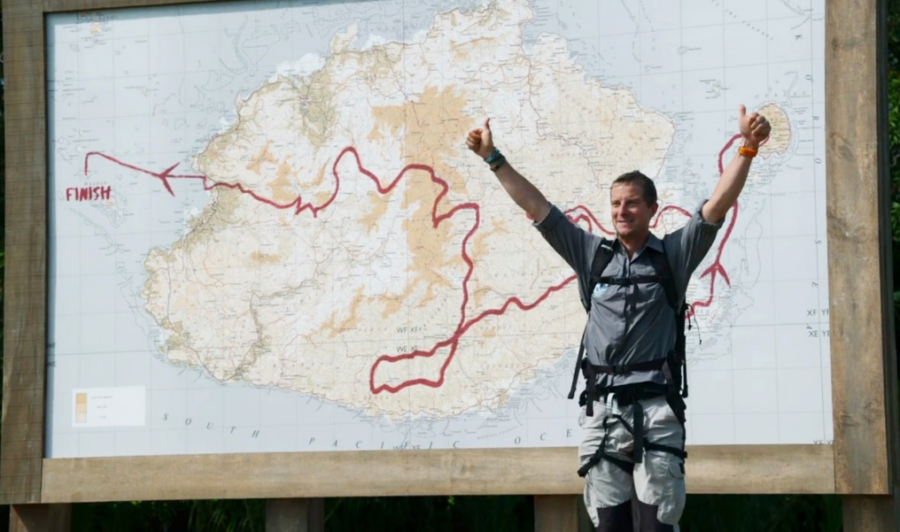
Eco-Challenge: Providing Digital Solutions for Real-Time Competitor Tracking
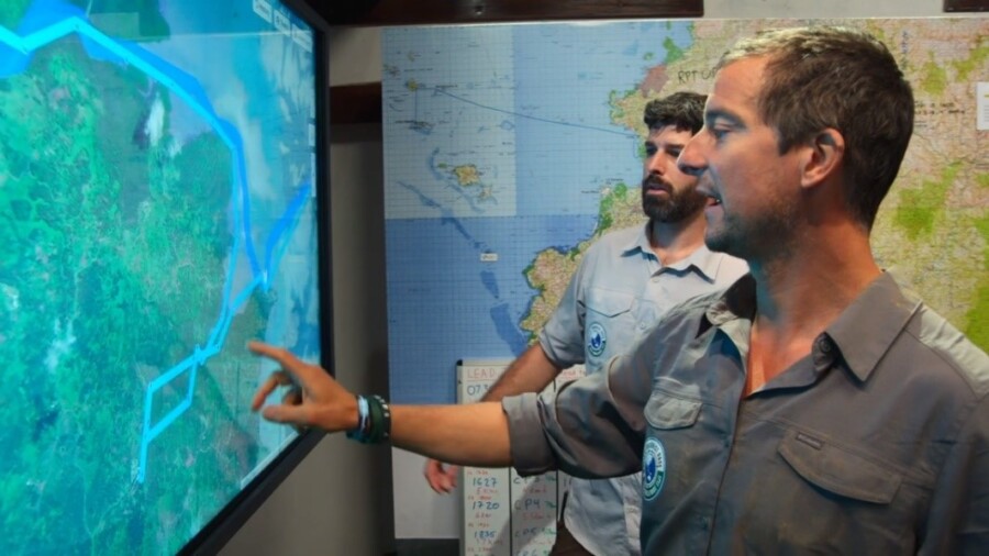
Though impressive, the large dry-erase map housed at Eco-Challenge Fiji headquarters lacked something crucial – the ability to track the progress of competitors in real time. This led to our final contribution: data for a digital tracking web app.
Had the show focused on teams racing through major highways in the United States, the production team may have been able to utilize existing services like Google Maps, Waze, or any number of open-source applications. The Eco-Challenge production team selected the competition territory because of its remote nature, though, and its mélange of river rapids, thick jungle, swampland, and ocean tides rendered any online web-based live-tracking application out of the question. The solution: a custom built, offline functioning, real-time digital tracking application, intended to be displayed on a large touchscreen located in production HQ. Each team was given a GPS transmitter that sent their signal to the HQ every 15 minutes, allowing for near-real time tracking. Not only was their location information available, producers could also monitor information such as average speed, total time and total distance since the last GPS pin drop.
Bear Grylls and Race Operations Coordinator, Philippe Gautier, examine team positions on the web app. Image courtesy of Amazon.
Our first step was to reformat the previously generated custom maps into basemap layers optimized for web application functionality and display.
In addition to the 50K and 250K topographic and nautical chart basemap layers, we also prepared and delivered tile packages of satellite imagery and digital elevation data for integration into the web application.
With each dataset treated as a separate layer, users could choose which map they wanted to have displayed in the background, whether that be large scale topographic mapping (similar to what the competitors were using) or satellite imagery.
Moreover, the imagery was prepared in such a way that allowed for two separate satellite imagery datasets to be combined into a single tileset for efficient display: low resolution imagery is employed at higher zoom levels, while the high-resolution images allow course details to stand out when Grylls’s hand hits the touchscreen to zoom in on team activity.
Finally, the digital elevation model (DEM) was integrated behind the scenes to enable terrain profiles and 3D rendering of the course with the imagery or other layers draped on top.
Our work with Eco-Challenge is a reminder that the use of geospatial data is as varied as its applications. The unique challenge of supplying data for a tracking app using maps created and printed by our team to monitor competitors who are competing, overcoming, and, ‘occasionally,’ suffering on a route our sourcing abilities helped select, is not lost on us. We are incredibly proud to have been able to offer our services and expertise on such an exciting event.
To stream the incredible work of the MGM Studios production team and the competitors they chronicle, head over to: https://www.amazon.com/Worlds-Toughest-Race-Eco-Challenge-Fiji-Season/dp/B08BB8S8FJ, and https://ecochallenge.com to see more behind-the-scenes content.
Eco-Challenge: Identifying Custom Mapping Requirements for The World’s Toughest Race
With a route finalized and data inputs identified, it was time to decide precisely what kind of maps the Eco-Challenge production team required. The need for three distinct types of maps emerged – a very large wall map for production headquarters, a smaller-scale overview map for staff, and a set of competitor maps. All told, to fully meet the Eco-Challenge team’s diverse needs, East View Geospatial produced 11 custom maps and printed a total of 991 maps in-house.
Perhaps the most recognizable of these maps, to viewers, is the large dry-erase wall map at 1:50,000 scale, housed in production headquarters. This map provides a comprehensive, detailed representation of both the area of competition and ideal routes through it, complete with topography and bathymetry. The map can be seen almost immediately in the first episode as the host, Bear Grylls, unveils the large map and welcomes competitors. The ability to make notations in dry-erase marker is a feature that ties the strength of physical maps with something closer to a modifiable GIS. Its scale also helps impress upon viewers the scope of the race. To create this map, we utilized in-house GeoMosaicing expertise, stitching data together from 20 existing 50K maps over Fiji and custom made hydrographic charts.
Host Bear Grylls unveils the course map as he welcomes the competitors. Image courtesy of Amazon.
For in-the-field staff, we developed a 1:250,000 scale course overview map. This map contains information not available to the competitors, like most efficient routes, transportation methods, and emergency points of interest. This information proved crucial as the production crew were up against the same natural hazards as their subjects, as detailed in the LA Times.
Finally, each team of adventure athlete competitors received a set of 9 custom maps and nautical charts. These maps consisted of mostly raw 50K data, organized by day and leg of the race. These maps are visible in the hands of teams as they break for navigation, or around their necks in clear bags as they progress through the race. Their misreading of these maps is also apparent from time to time, illustrating the limits and advantages of physical maps and the skills necessary to utilize them.