ShotSpotter: Using Geospatial Technology To Create a Safer World
Location-based data continues to evolve and with this evolution comes game-changing innovation. Recently, geospatial data has been instrumental in developing ShotSpotter, a new technology that detects gunfire almost immediately and alerts authorities, allowing for faster emergency response times.
ShotSpotter works by using stationary acoustic sensors. These sensors are mounted on buildings and other structures throughout a city. The software within the sensors filters out white noise- like wind or automobile sounds. In order for a noise to potentially be considered a gunshot, three sensors must be triggered. The time it takes for the sound to reach the sensors is used to effectively triangulate a precise location of where the shots were fired.
Software within the sensors also compares the detected sound with a library of known gunfire sounds. If the sound matches and is classified as “likely gunfire”, it is sent to the ShotSpotter Incident Review Center to determine whether the authorities need to be notified. Once the sound has been reviewed by the Incident Review Center and has been classified as gunfire, alerts are sent to the local authorities via the ShotSpotter mobile, desktop, and browser apps, allowing police to access the data from anywhere. Although it may seem like a lengthy process, the entire chain of events, from gunfire to alert of authorities, takes place in less than a minute!
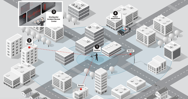
Image courtesy of ShotSpotter.
Precise location data is necessary to ensure police can respond quickly to the exact area the gunfire incident occurred. In addition to helping authorities on the ground, ShotSpotter has been utilized in the courtroom as evidence. Each noise incident recorded on ShotSpotter is timestamped and georeferenced, which can be crucial when constructing a timeline of events.
Technology like ShotSpotter is making the world a safer place, and it relies on geospatial data to do so. Currently, over 100 U.S. cities use ShotSpotter, and that number continues to grow. ShotSpotter is yet another example of how geospatial data can be leveraged to make the world a better place to be. To learn more about how geospatial information is used in litigation, check out this blog post.
Are All Maps Created Equal?
We have previously written about the way maps can shape people’s conception of reality. That dynamic holds true in the realm of politics, too – especially during a national election.
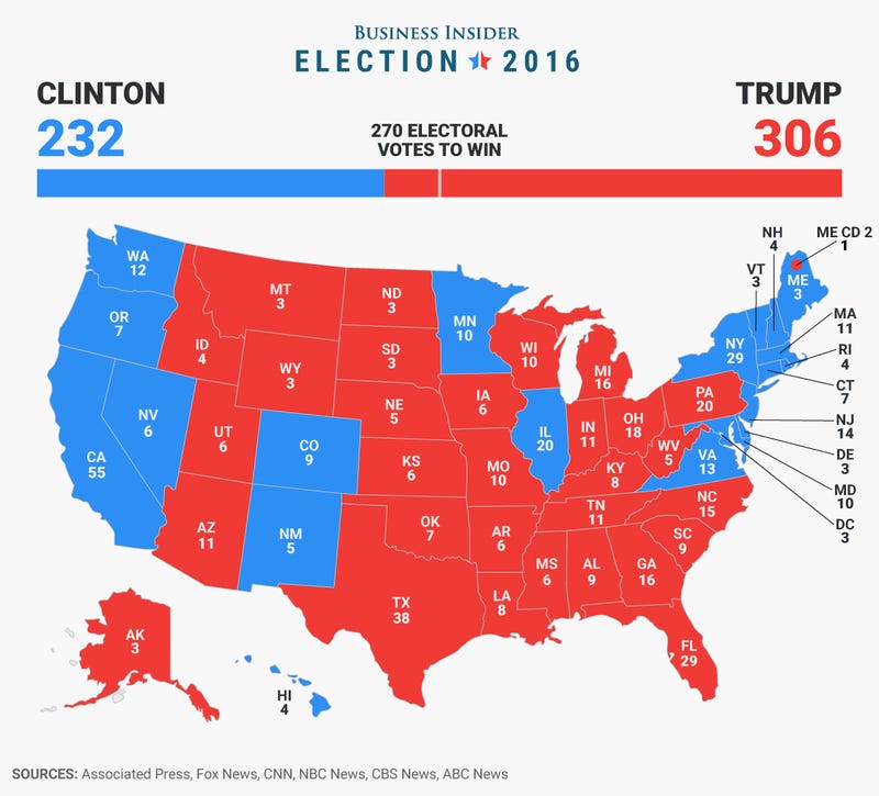
In the United States last week, as election results for the national presidential contest started coming in, broadcast television became a torrent of maps. On this night, the map is the star of the show – as the protagonist or antagonist depends on your political persuasion. More importantly, these maps, used by anchors and correspondents to aid the electorate in visualizing the results, are all data-driven and powered by GIS technology. The most ubiquitous variety is a flat choropleth map. This is the now-familiar thematic map of the states color-coded according to which party their popular votes go for.
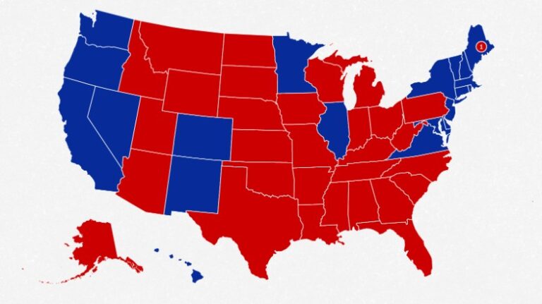
A choropleth map of electoral college results from the 2016 U.S. Presidential election. Map courtesy of CNN.
The electoral college system dictates that Americans’ votes are tallied state by state. Winners receive points, known as electoral votes, for the states they win. These flat maps, with (usually) large swaths of red dominating states with larger territory than populations are how most Americans mentally organize the political landscape of their county. The real picture, however, is far more nuanced.
While flat, color-coded choropleth maps depict the differences in state-to-state political outcomes, they cannot accurately represent outcomes in terms of actual percentage of population. In these cases, maps that emphasize population, rather than district boundaries, can be better visualizations of the national situation.
One option is a cartogram, a map where a variable like population or income is used instead of land area. In the case of US elections, a cartogram representation would distort the familiar shape of the continental United States into shapes that reflect numbers of voters instead. The swirling lines of Ersi cartographer Kenneth Field’s 2016 contiguous cartogram shows that effect.
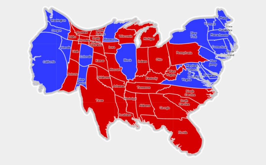
A contiguous cartogram of the 2016 U.S. Presidential election results created by Esri.
In 2016, Field created a variety of thematic maps of the 2016 presidential election. These range from traditional to borderline-fantastical (one map allows for a layer of Star Wars Tie Fighters to appear). In some, the difference comes down to symbology such as color or texture. His choropleth unclassed blended hue map takes a flat map and breaks it into voting districts. The result is a more visually diverse representation than when single colors are applied state-by-state.
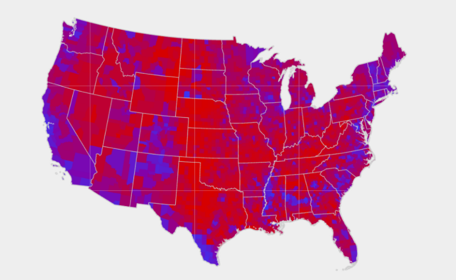
A blended choropleth map of the results of the 2016 U.S. Presidential election. Map courtesy of Esri.
These advances in mapping are not the first time the American population has seen an enhanced ability to break down its election results. After the 1880 presidential election, Harry Gannett, census superintendent, drew a map that broke down results in a district-by-district way. This shifted the thinking about the political solidarity of states.
Will election maps on TV look any different come 2022? Potentially, though the flat choropleth map does have one advantage: it’s can be easily interpreted even when the TV is muted.
And The Election’s Winner Is…GIS!
As anyone who’s ever scoured raw county reports from a secretary of state page knows, election results are not easily digestible by nature. Raw numbers may have stories to tell, but humans process visual data, whether color-coded, textured, uniquely-shaped, or otherwise, much faster. That’s why major news outlets and academic institutions utilize spatial data and GIS to broadcast and analyze election results, both in real-time and years after.
In fact, some even use it in the lead-up, to predict results. FiveThirtyEight’s popular election prediction map for the 2020 presidential election allows users to move votes in and out of states, to see the possible electoral outcomes. The underpinnings of this are rooted in GIS and spatial data. The map must consider various elements, like if the state is a winner take all or proportional awarder of electoral votes, as well as precinct and district boundaries. This isn’t the only method people use to predict elections; Twitter tracks reactions and engagement to various news stories, and Amazon’s data regarding political book sales, when geocoded, can reveal trends polls might miss.
Once the votes are in, however, all eyes are on the actual results of the contest. This UCLA Sandbox article explains one process for creating a map that reflects the results of an election contest.
Election results, or, ‘tabular data,’ are essentially raw vote tallies in spreadsheet form. These are combined with state, county, or district geographic data. Once the two are paired and linked, numbers are assigned to locations on a map, and a digestible picture emerges. From there, color-coding can be applied, like in the US, where ‘red’ symbolizes Republican votes and ‘blue’ represents Democratic ones.
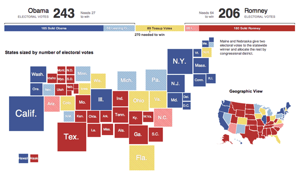
How the data is visualized is up to the content provider. This GIS Lounge article takes a look at the various forms of visualization utilized by major news providers after the US presidential election in 2012. An example of unique visualization comes from The New York Times, this map (seen below) displays state size to reflect the number of electoral votes each state has, the more electoral votes, the larger the box representing the state. The resulting map uses color (red for Republican, blue for Democrat, and yellow for Tossup) to display which way states voted in the 2012 presidential election.
Election analysis doesn’t end when winners are declared, though. Political scientists and journalists use past elections to glean insights about the country’s political attitudes. This study, for example, analyzes the increasing polarization of voters. Thanks to publicly shared shapefiles, precinct data, demographic data, and digital boundary definitions, this kind of analysis is not solely for the big-money major news networks anymore. GIS & other spatial technology have made it easier for all to understand election data and results through visualization.
See our other two blog posts on how geospatial information plays an important role in political campaigns & elections:
Increasing Fairness & Accessibility in Elections Through Spatial Data
How U.S. Election Campaigns Harness GIS Data For Voter Outreach
Increasing Fairness & Accessibility in Elections Through Spatial Data
In last week’s post, we detailed some of the ways political campaigns use GIS and spatial information to bolster their efforts. Just as contenders in those contests benefit from diverse data, so too can parties responsible for organizing and running those elections. The goal? To make voting freer, fairer, and more accessible.
In much the same way geo-tagging voters helps campaigns identify areas and addresses to target, the people who organize can use spatial data to communicate information, place voters in correct districts, and set up enough polling places to satisfy voter demand (thereby avoiding long lines at the polls). In 2019, NSGIC released a guide for GIS-enabled elections, which they made available here. The document outlines five best practices, which consist of hiring a team of specialists, creating and maintaining a voting unit GIS layer, developing a statewide geocoding strategy, assembling a contextual GIS layer, and implementing a data validation process.
Those practices are aimed at increasing voter turnout, making participation easier, and clarifying who should be voting where. At times, however, those goals seem at odds with existing districting systems.
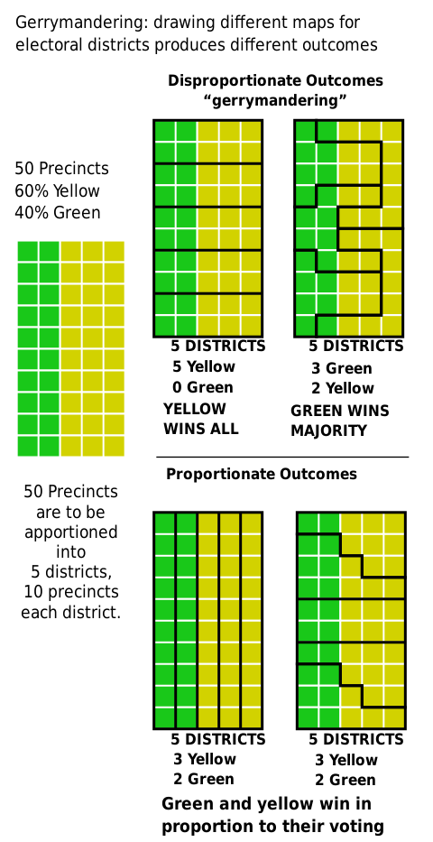
In the US (though the issue persists in other representative democracies), “gerrymandered” districts are something most voters can agree are unfair. Gerrymandering is the practice of manipulating district boundaries to tip the balance in favor of one party or another. In the US, efforts to stymie gerrymandering have been met with resistance from law makers, despite the practice’s unpopularity. The result is an electoral map filled with shapes only an incumbent could love.
Diagram courtesy of M. Boli, CC BY 4.0
Luckily, spatial data has no political affiliations or aspirations, and leveraging its objectivity is a way to increase the fairness and accessibility of elections in systems like that in the US. And with 2020 census data on the horizon, a new way forward is possible.
As detailed in this article from GIS Lounge, there are specific indicators that point to an un-tenably gerrymandered district. Voting history and district’s boundaries are compared against data like demographic breakdowns, landscape features, income averages, metrics of shape, and other local factors.
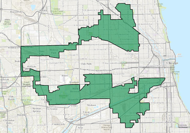
A gerrymandered district in Illinois. Image courtesy of CBS News.
This study by Kamyoung Kim of Kyungpook National University’s Department of Geography Education details a specific approach for optimizing spatial data to detect biased districts, called the capacitated double p-median problem with preference (CDPMP-P) approach. This approach analyzes a district’s spatial data, population relative to representation, and whether or not the voting infrastructure is robust. If the area scores high, it is likely not gerrymandered. A low score, however, means that district may need a democratic overhaul.
With these tools, election officials and organizers can help shepherd electorates around the world into a fairer democratic future.
How U.S. Election Campaigns Harness GIS Data For Voter Outreach
In previous posts, we’ve covered how governments utilize GIS and diverse spatial data to respond to crises and plan for future ones. In nations with electoral systems like the United States, people who want ‘in’ to the government utilize much of that same information to run their campaigns and spur voter turnout.
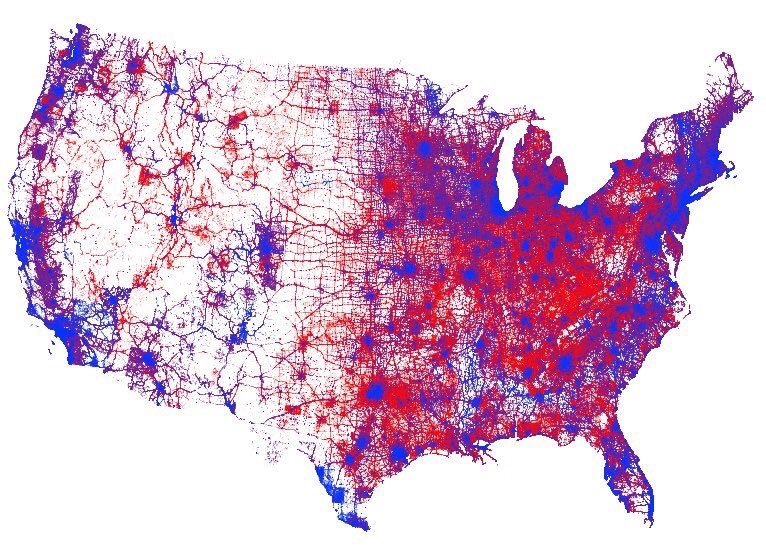
A visual representation of every vote cast in the 2016 United States presidential election. Image courtesy of Kenneth Field and Esri.
Since the early 2000s, (or at least as far back as 2004) political campaigns have added ‘microtargeting’ to their tool kits – essentially turning direct marketing methods into outreach tools for campaigns.
In this post from 2008, Karsten Vennemann of Terra GIS describes his experience working for the Obama campaign. Back then, he made use of open-source technology to identify and target specific voters. Put simply, the process allowed the campaign to lay voter data over base layers like precinct and county boundaries. The approach was so well liked, according to Vennemann, it was implemented in roughly a dozen highly contested states.
Today, tools like those offered by Esri’s ArcGIS have streamlined that process of turning addresses into useable data points. The first step is turning a list of addresses into a ‘geocoded’ list of voters. To do this, tools like Esri’s Tapestry Segmentation will analyze neighborhoods by socioeconomic and demographic factors. The program then classifies neighborhoods using 67 categories of market segments based on information like income, hobbies, education, and religious affiliation. Combine the Tapestry information with a list of addresses, and a picture of potential voters and donors emerges.
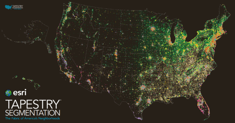
Esri Tapestry information of potential donors & voters. Image courtesy of Esri.
When that data is combined with information about boundaries and districts, campaigns can begin formulating ground plans. They can focus their attention on areas with potential support, while also avoiding areas where their cause may be hopeless. Essentially, this eliminates figuring out where to door-knock the hard way.
In today’s world of online data, evolving voter habits, and other factors, the ways in which this approach can be applied will likely continue to evolve. In next week’s post, we’ll take a look at how governments can use these same tools to ensure fair, accurate elections.

